This article was published as a part of the Data Science Blogathon
Introduction
The twenty-first century can be regarded as the era of data-driven decision-making. Organizations having a pile of data can help to make advantageous future decisions. This decision-making backed by visualizations puts the cherry on the cake making it easier to understand for the viewers unaware of the math behind this decision-making. Thus, the need for visualization has been growing since then.
But knowing something is not enough and one must always focus on improvising the existing methods or tools to perform a certain task most efficiently. With a similar objective, the need for advanced visualization techniques has been increasing rapidly. One of the advanced visualizations we are going to talk about is the Donut Chart.

Table of Contents
- What are Donut Plots?
- Building Donut Plots in Python
- Practical Examples
- Advantages and Disadvantages
- Conclusions
What are Donut Charts?
Donut Charts or Doughnut Charts are a special kind of Pie chart with the difference that it has a Blank Circle at the center. The whole ring represents the data series taken into consideration. Each piece of this ring represents the proportion of the whole Data Series or percentage of total if the whole ring represents 100% of data. Donut Chart got its name from the Donuts which has a circle at its center.
Donut Charts help answer questions such as How much a category is the percent of total or How much area two pieces constitutes of the whole. The blank circle at the center can be used to show additional statistical or general information about the data.

Image by Mikael Blomkvist from Pexels
Building Donut Plots in Python
The whole pie chart can be built with one infamous matplotlib library of Python. It is built the same way pie charts are built with some additional commands to get the blank space at the center.
1. Importing Libraries
import numpy as np
import matplotlib.pyplot as plt
2. Creating Random Data
Python Code:
import numpy as np
import matplotlib.pyplot as plt
data = np.random.randint(20, 100, 6)
print(data)
3. Plotting Pie Chart of the made-up data
plt.pie(data)
4. Creating a Circle
circle = plt.Circle( (0,0), 0.7, color='white')
5. Adding circle to the Pie Chart
p=plt.gcf()
p.gca().add_artist(circle)
The gcf() & gca() methods stand for get current figure & get current axis respectively. The add_artist() method of axes class is used to add artist to the axis (here referenced by .gca() )
6. Putting it all together
import numpy as np
import matplotlib.pyplot as plt
data = np.random.randint(20, 100, 6)
plt.pie(data)
circle = plt.Circle( (0,0), 0.7, color='white')
p=plt.gcf()
p.gca().add_artist(circle)
plt.show()
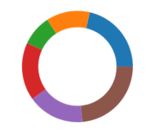
A Simple Donut Chart (Image Source – Personal Computer)
Adding Extra Parameters to Donut Chart
1. Adding Annotations to the Donut Chart
import matplotlib.pyplot as plt
import numpy as np
data = np.random.randint(20, 100, 6)
plt.pie(data, labels = ['A', 'B', 'C', 'D', 'E', 'F'])
circle = plt.Circle( (0,0), 0.7, color='white')
p = plt.gcf()
p.gca().add_artist(circle)
plt.show()
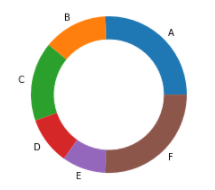
Donut Chart with Annotations (Image Source – Personal Computer)
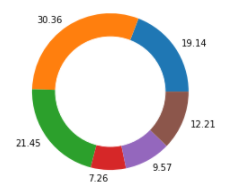
2. Adding Percent of Total as Annotations to the Donut Chart
import matplotlib.pyplot as plt
import numpy as np
data = np.random.randint(20, 100, 6)
total = sum(data)
data_per = data/total*100
plt.pie(data_per, labels = [round(i,2) for i in (list(data_per))])
circle = plt.Circle( (0,0), 0.7, color='white')
p=plt.gcf()
p.gca().add_artist(circle)
plt.show()
3. Exploding a Part of the Donut Chart with Annotations
import matplotlib.pyplot as plt
import numpy as np
data = np.random.randint(20, 100, 6)
total = sum(data)
data_per = data/total*100
explode = (0.2, 0, 0, 0, 0, 0)
plt.pie(data_per, explode = explode, labels = [round(i,2) for i in (list(data_per))])
circle = plt.Circle( (0,0), 0.7, color='white')
p=plt.gcf()
p.gca().add_artist(circle)
plt.show()
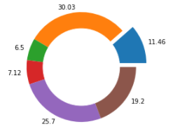
Donut Chart with Percent of Total Values as Annotations and First Part Exploded
**The Donut Charts shown above are not the actual representation of what we get as an output. Since we used np.random(), we will get a different Donut Chart every time we run the given code.
Practical Examples
1. Donut Chart of Sports interest of Students in Class
A donut chart can be built based on interest in 3 kinds of sports: Cricket, Football, Basketball by counting the numbers of students in each of these types & displaying the total number of students at the center or displaying all the types of sports taken into consideration. By the size of the Donut Chart, we can get a rough estimate of what the majority of the class likes the sport more than the other two.
2. Donut Chart of Sales of Books at a Bookshop
A donut chart can be built based on the sales made by a bookshop over a week with the total number of books sold displayed at the center. The components of this donut chart consist of genres of the book purchased by the customers. This will give a rough estimate of what genre of book people are more interested to buy. This would help the bookshop take decisions as well as procuring marketing campaigns.
3. Donut Chart of Personal Expenditure
A donut chart can be built based on one’s personal expenditure over the month with total money spent & total money saved displayed at the center. The Donut ring would consist of different categories of expenditure such as Entertainment, Food, Necessities, Bills, etc. This would help one evaluate the next month’s budget & the categories which can help save money.
Advantages & Disadvantages
Advantages
Donut Plots are Easy to Plot
Donut Plots are User friendly and can be read by anyone
Can easily add or remove data & the whole donut chart gets adjusted with the remaining data
Can be extensively used for the comparison of categories
Due to the large availability of the room, extra information can be added at the center
Disadvantages
Cannot determine the exact value of a category unless annotated
Could be misinterpreted unknown angles of parts of Donut Chart
Donu Charts may get cluttered if more categories are added
Negative values cannot be shown in a Donut Chart
Conclusion
Thus, Donut Charts are giving desired results for what they are meant for at the end of the day. A more number of parameters can be added to the Plot code which I highly encourage the readers to do to create their own version of creating & more informative Donut Charts. One can try changing the colors or palettes of the parts of the ring & manipulating wedgeprops parameter of plt.pie().
Donut Charts can be built in other tools and languages as well such as R Programming Language, Microsoft Excel, Tableau, Power BI, et Cetra. Donut Charts become difficult to interpret sometimes & thus are not always advised to use. For comparing the values of categories, one must always choose Bar Charts. But it’s always good to know multiple visualization techniques.
About the Author
Connect with me on LinkedIn Here.
Check out my other Articles Here
You can provide your valuable feedback to me on LinkedIn.
Thanks for giving your time!
The media shown in this article are not owned by Analytics Vidhya and are used at the Author’s discretion.
IT Engineering Graduate currently pursuing Post Graduate Diploma in Data Science.


