This article was published as a part of the Data Science Blogathon.
We have worked on different data visualization libraries over the last decade. Data visualization is the way to tell stories by curating data into a more simple plot and helps us understand and highlight the key trends in our data.
Introduction
A sound data visualization library allows you to highlight helpful information by plotting interactive charts and working with your choice of datasets. You can dig deeper, navigate through all insights, and visualize different charts and plots.
However, to experience the actual benefits of data visualization and choose the best one for your project requires immense research and hands-on practice. This is why I have decided to introduce you to Pygal.
Today’s guide will introduce you to Pygal, and it will explain its important and valuable features of Pygal. Furthermore, it explains why you should use Pygal, its benefits, and comparison with other data visualization libraries, and then we will get our hands on the implementation and installation of the Pygal library on your system.
However, the motive behind writing this guide is to explain to a wide array of audiences how amazing open-source communities and software are doing. I have no intentions to promote this or different data visualization libraries. Hence, this guide will give you enough knowledge to choose the best answer for yourself.
So let’s dive right into this tutorial on Pygal.
What Is Pygal?
Pygal is an open-source data visualization library in Python. It is one of the best python libraries to create highly interactive plots and charts for different datasets.
Also, it allows you to download your visualizations in SVG (Scalable Vector Graphics) or PNG (Portable Graphics Format) for multiple applications and customize it accordingly.
It can be downloaded for Python 3.6, 3.7, 3.8, 3.9, and pypy and its Linux Distribution Packages for the following versions of Linux are:
- Fedora
- Gentoo
- Ubuntu
- Debian
- Arch Linux
You can download its main package that holds all available charts, the config class, and map extensions namespace modules.
When To Use Pygal
Pygal is one Python data visualization library that allows you to create stylish and interactive python plots with minimal coding efforts.
However, if you wonder what projects or scenarios to use Pygal, then if you want optimal resolution for printing the plots on your machine, Pygal allows you to download your visualizations in SVG, PNG, Etree, Base 64 data URI, Browser, and PyQuery.
Furthermore, you can use Pygal to display your plots using Flask App or Django response or directly in your HTML by referring its embeddings to webpages documentation.
When working with a complex dataset, choose Pygal because it is highly customizable and provides you with different charts (line, bar, Histogram, pie, box, dot, etc.), styles (Built-in style, parametric styles, etc), chart configurations, serie configurations, value configurations (labels, style, node attributes, links), sparklines (spark text, etc), tables (style, total, transposed), and output formats.
Benefits Of Pygal
You must now know that Pygal allows you to create beautiful interactive charts and its completely open-source library. Now, we will emphasize some of the best features, making them worth using in your projects.
- It has three separate map packages to keep the module small in size and easy to use for users.
- It gives interactivity for most graphs that provide you with data exploration, filtering out certain features, zooming in/out, and much more.
- It is optimized with rich support and community to allow users to create and work with SVG images.
- It allows you to be visionary by providing three main concepts- Data, layout, and figure objects. Using these concepts, you can solve multiple complex visualization problems with ease.
Comparison With Other Popular Python Data Visualization Libraries In The Market
There are many different visualization libraries available on the internet. Matplotlib is known for its powerful features, Seaborn is known for its ease to use, Bokeh is known for its interactivity, Plotly is known for its collaborations, etc.
Similarly, Pygal is famous for its support in working with SVG images. Nevertheless, let us compare Pygal with other libraries and understand why most data scientists still prefer other libraries over Pygal.
Pygal
Github Link: https://github.com/Kozea/pygal
Github Stars: 2.4K
Github Watchers: 136
Github Forks: 398
Github Contributors: 62
Code Quality: L2
Programming Language: Python
Matplotlib
Github Link: https://github.com/matplotlib/matplotlib
Github Stars: 15.2K
Github Watchers: 573
Github Forks: 6.3K
Github Contributors: 1143
Code Quality: L3
Programming Language: Python
Seaborn
Github Link: https://github.com/mwaskom/seaborn
Github Stars: 9.2K
Github Watchers: 248
Github Forks: 1.6K
Github Contributors: 148
Code Quality: L2
Programming Language: Python
Plotly
Github Link: https://github.com/plotly/plotly.py
Github Stars: 11.1K
Github Watchers: 271
Github Forks: 2.1K
Github Contributors: 175
Code Quality: L2
Programming Language: Python
Implementation (Installation, different methods, and functions) with an example code
After understanding the Pygal library and its benefits, we saw its comparison with other visualization libraries. We are all set to explore all the practical features and implement Pygal in your project.
Open jupyter notebook and start coding:
!pip install pygal
import pygal
The above command will install the pygal library onto your machine.
Now we will see different styles of plots available with the pygal library.
1. Line Graph
With different line graphs that come with pygal, it is simple and easy to plot them.
You start with importing the pygal library and then create an object of type chart. For example, in a simple line graph, you use pygal.Line() or pygal for a horizontal line pygal.HorizontalLine().
Let us see different types of line plots below:
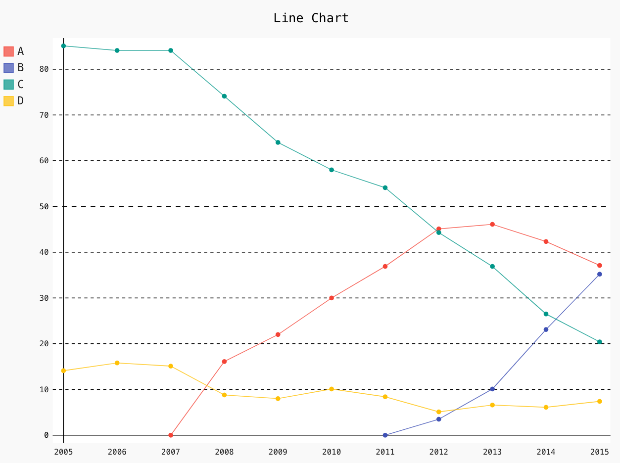
Line_Chart = pygal.Line()
Line_Chart.title = ' Line Chart'
Line_Chart.x_labels = map(str, range(2005, 2016))
Line_Chart.add('A', [None, None, 0, 16.1, 22, 30, 36.9, 45.1, 46.1, 42.33, 37.11])
Line_Chart.add('B', [None, None, None, None, None, None, 0, 3.5, 10.1, 23.1, 35.2])
Line_Chart.add('C', [85.1, 84.1, 84.1, 74.1, 64, 58.0, 54.1, 44.3, 36.9, 26.5, 20.4])
Line_Chart.add('D', [14.1, 15.8, 15.1, 8.8, 8, 10.1, 8.4, 5.1, 6.6, 6.1, 7.4])
Line_Chart.render_to_file('Line_Chart.svg')
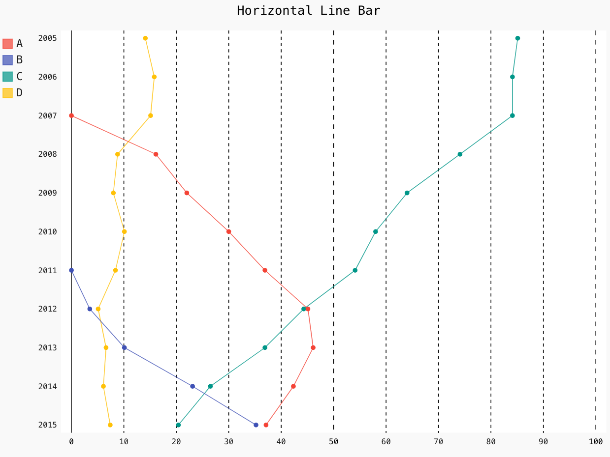
Line_Chart = pygal.HorizontalLine()
Line_Chart.title = 'Horizontal Line Bar'
Line_Chart.x_labels = map(str, range(20005, 2016))
Line_Chart.add('A', [None, None, 0, 16.1, 22, 30, 36.9, 45.1, 46.1, 42.33, 37.11])
Line_Chart.add('B', [None, None, None, None, None, None, 0, 3.5, 10.1, 23.1, 35.2])
Line_Chart.add('C', [85.1, 84.1, 84.1, 74.1, 64, 58.0, 54.1, 44.3, 36.9, 26.5, 20.4])
Line_Chart.add('D', [14.1, 15.8, 15.1, 8.8, 8, 10.1, 8.4, 5.1, 6.6, 6.1, 7.4])
Line_Chart.range = [0, 100]
Line_Chart.render_to_file('Line_Chart_hori.svg')
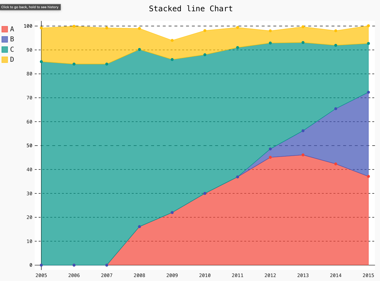
Line_Chart = pygal.StackedLine(fill=True)
Line_Chart.title = 'Stacked line Chart'
Line_Chart.x_labels = map(str, range(2005, 2016))
Line_Chart.add('A', [None, None, 0, 16.1, 22, 30, 36.9, 45.1, 46.1, 42.33, 37.11])
Line_Chart.add('B', [None, None, None, None, None, None, 0, 3.5, 10.1, 23.1, 35.2])
Line_Chart.add('C', [85.1, 84.1, 84.1, 74.1, 64, 58.0, 54.1, 44.3, 36.9, 26.5, 20.4])
Line_Chart.add('D', [14.1, 15.8, 15.1, 8.8, 8, 10.1, 8.4, 5.1, 6.6, 6.1, 7.4])
Line_Chart.render_to_file('Line_Chart_stack.svg')
2. Bar Graph
With different Bar plots that comes with pygal, it is simple and easy to plot them.
You start with importing the pygal library and then create an object of type chart. For example, in a simple bar graph, you use pygal. Bar() or pygal for a horizontal bar pygal.HorizontalLine().
Let us see different types of bar plots below:
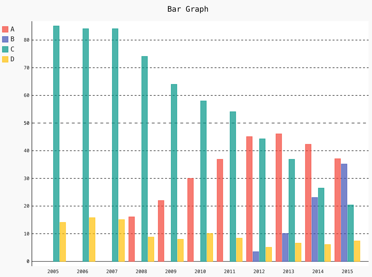
Bar_Chart = pygal.Bar()
Bar_Chart.title = ' Bar Graph '
Bar_Chart.x_labels = map(str, range(2005, 2016))
Bar_Chart.add('A', [None, None, 0, 16.1, 22, 30, 36.9, 45.1, 46.1, 42.33, 37.11])
Bar_Chart.add('B', [None, None, None, None, None, None, 0, 3.5, 10.1, 23.1, 35.2])
Bar_Chart.add('C', [85.1, 84.1, 84.1, 74.1, 64, 58.0, 54.1, 44.3, 36.9, 26.5, 20.4])
Bar_Chart.add('D', [14.1, 15.8, 15.1, 8.8, 8, 10.1, 8.4, 5.1, 6.6, 6.1, 7.4])
Bar_Chart.render_to_file('Bar_Chart.svg')
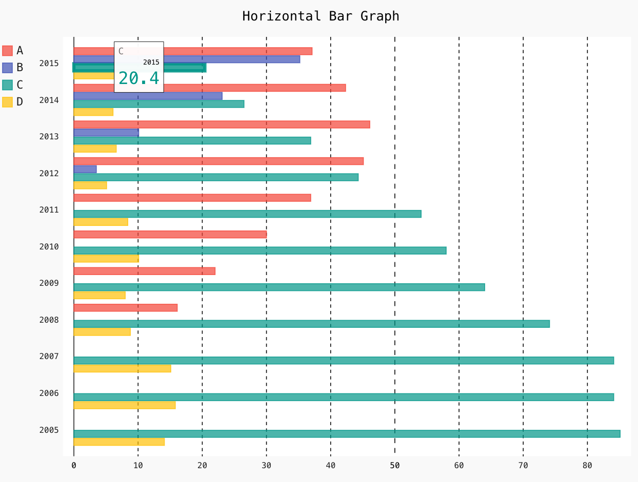
Bar_Chart = pygal.HorizontalBar()
Bar_Chart.title = 'Horizontal Bar Graph'
Bar_Chart.x_labels = map(str, range(2005, 2016))
Bar_Chart.add('A', [None, None, 0, 16.1, 22, 30, 36.9, 45.1, 46.1, 42.33, 37.11])
Bar_Chart.add('B', [None, None, None, None, None, None, 0, 3.5, 10.1, 23.1, 35.2])
Bar_Chart.add('C', [85.1, 84.1, 84.1, 74.1, 64, 58.0, 54.1, 44.3, 36.9, 26.5, 20.4])
Bar_Chart.add('D', [14.1, 15.8, 15.1, 8.8, 8, 10.1, 8.4, 5.1, 6.6, 6.1, 7.4])
Bar_Chart.render_to_file('Bar_Chart_hori.svg')
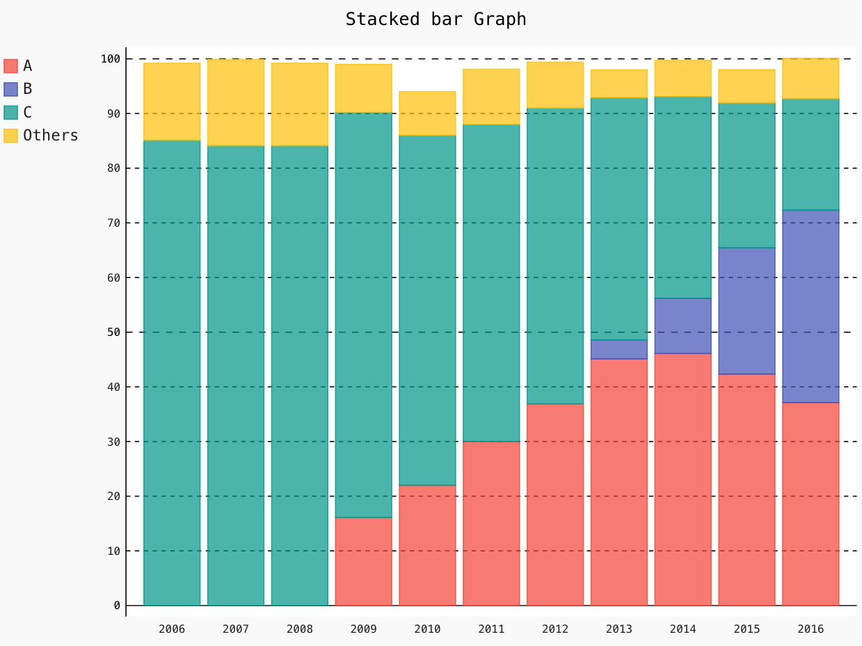
Bar_Chart = pygal.StackedBar()
Bar_Chart.title = 'Stacked bar Graph'
Bar_Chart.x_labels = map(str, range(2006, 2017))
Bar_Chart.add('A', [None, None, 0, 16.1, 22, 30, 36.9, 45.1, 46.1, 42.33, 37.11])
Bar_Chart.add('B', [None, None, None, None, None, None, 0, 3.5, 10.1, 23.1, 35.2])
Bar_Chart.add('C', [85.1, 84.1, 84.1, 74.1, 64, 58.0, 54.1, 44.3, 36.9, 26.5, 20.4])
Bar_Chart.add('Others', [14.1, 15.8, 15.1, 8.8, 8, 10.1, 8.4, 5.1, 6.6, 6.1, 7.4])
Bar_Chart.render_to_file('Bar_Chart_stack.svg')
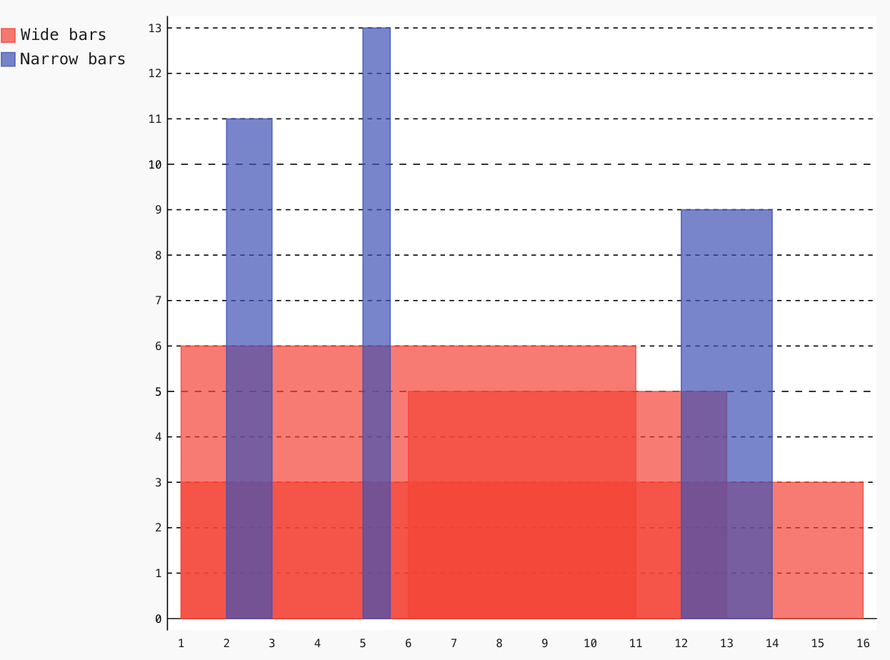
3. Histogram
Next in the list, we have a unique bar type that takes 3 parameters, named Histogram. It takes height, x-start and x-end as the parameters.
Let us plot a simple Histogram below:
Hist = pygal.Histogram()
Hist.add('Wide bars', [(6, 1, 11), (5, 6, 13), (3, 1, 16)])
Hist.add('Narrow bars', [(11, 2, 3), (13, 5, 5.6), (9, 12, 14)])
Hist.render_to_file('Histogram.svg')
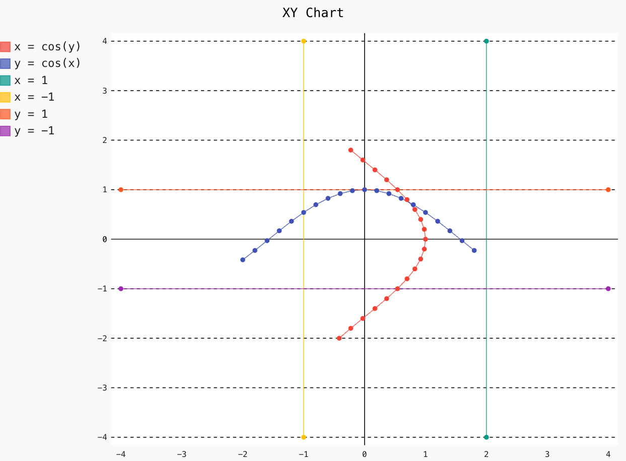
4. XY
You can design a chart in the XY plane with the help of inbuilt-methods. Let’s draw cosinus below:
from math import cos
XY_chart = pygal.XY()
XY_chart.title = 'XY Chart'
XY_chart.add('x = cos(y)', [(cos(x / 20.), x / 20.) for x in range(-40, 40, 4)])
XY_chart.add('y = cos(x)', [(x / 20., cos(x / 20.)) for x in range(-40, 40, 4)])
XY_chart.add('x = 1', [(2, -4), (2, 4)])
XY_chart.add('x = -1', [(-1, -4), (-1, 4)])
XY_chart.add('y = 1', [(-4, 1), (4, 1)])
XY_chart.add('y = -1', [(-4, -1), (4, -1)])
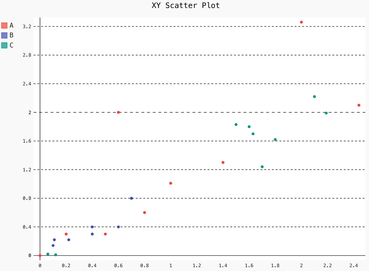
For a scatter plot, disable the stroke in the XY object.
XY_chart = pygal.XY(stroke=False)
XY_chart.title = 'XY Scatter Plot'
XY_chart.add('A', [(0, 0), (.2, .3), (.5, .3), (.6, 2), (.8, .6), (1, 1.01), (1.4, 1.3), (2, 3.26), (2.44, 2.1)])
XY_chart.add('B', [(.1, .14), (.11, .22), (.4, .4), (.6, .4), (.22, .22), (.4, .3), (.7, .8), (.7, .8)])
XY_chart.add('C', [(.06, .02), (.12, .01), (1.6, 1.8), (1.63, 1.7), (1.8, 1.62), (1.5, 1.83), (1.7, 1.24), (2.1, 2.22), (2.19, 1.99)])
XY_chart.render_to_file('xy_scatter.svg')
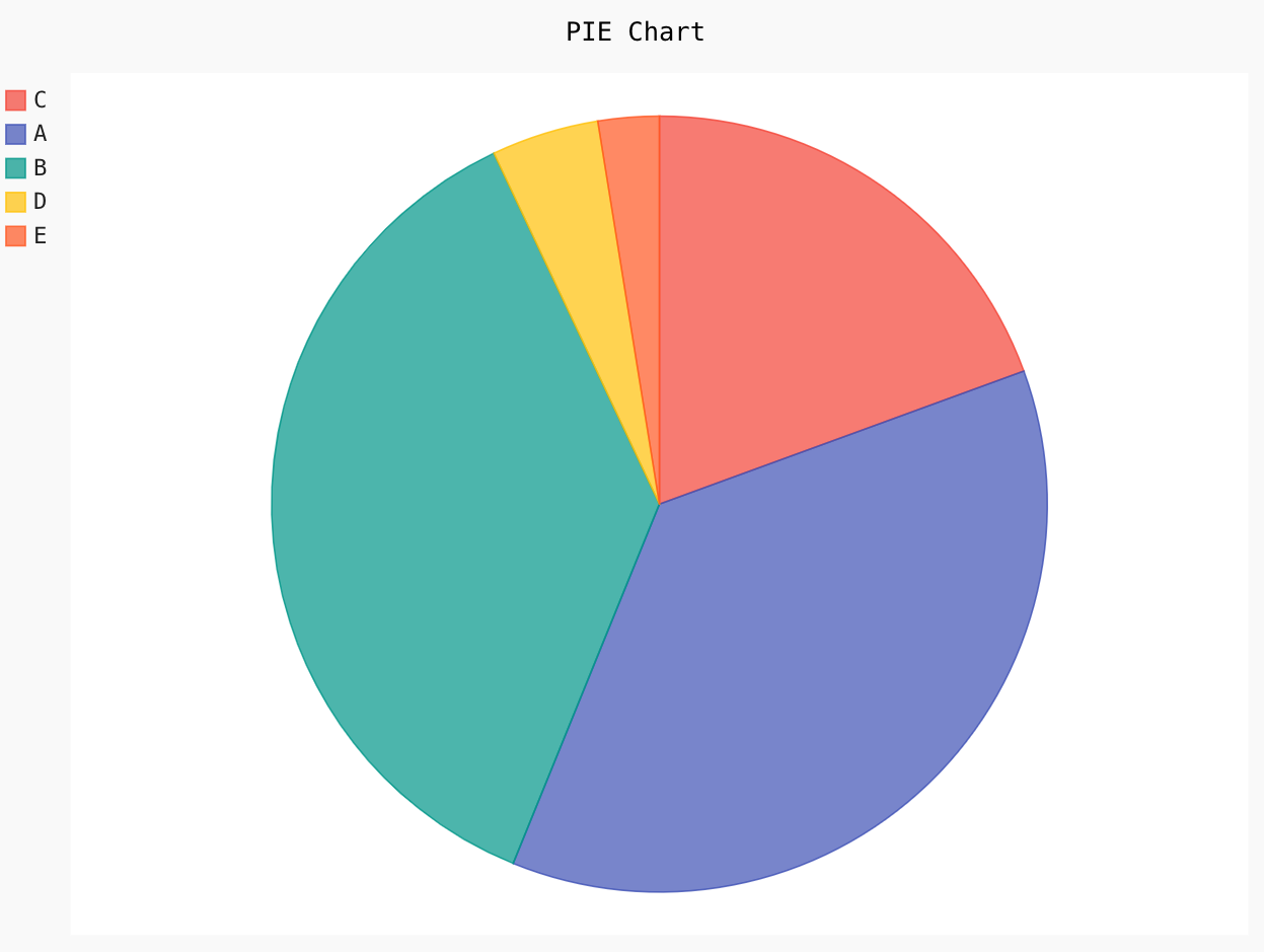
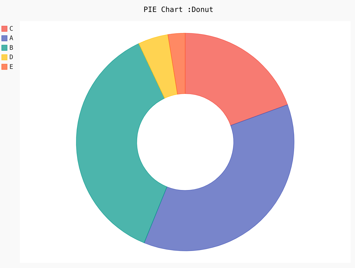
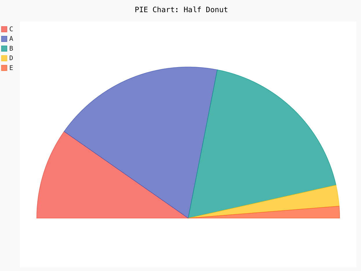
5. Pie
Different types of pie charts in pygal are half pie, donuts, or multi-series pie charts.
Let us implement some below:
Pie_Chart = pygal.Pie()
Pie_Chart.title = 'PIE Chart'
Pie_Chart.add('C', 19.1)
Pie_Chart.add('A', 36.1)
Pie_Chart.add('B', 36.2)
Pie_Chart.add('D', 4.4)
Pie_Chart.add('E', 2.5)
Pie_Chart.render_to_file('PC.svg')
Pie_Chart = pygal.Pie(inner_radius=.4)
Pie_Chart.title = 'PIE Chart :Donut'
Pie_Chart.add('C', 19.1)
Pie_Chart.add('A', 36.1)
Pie_Chart.add('B', 36.2)
Pie_Chart.add('D', 4.4)
Pie_Chart.add('E', 2.5)
Pie_Chart.render_to_file('PC_Donut.svg')
Pie_Chart = pygal.Pie(half_pie=True)
Pie_Chart.title = 'PIE Chart: Half Donut'
Pie_Chart.add('C', 19.1)
Pie_Chart.add('A', 36.1)
Pie_Chart.add('B', 36.2)
Pie_Chart.add('D', 4.4)
Pie_Chart.add('E', 2.5)
Pie_Chart.render_to_file('HALF-PC_Donut.svg')
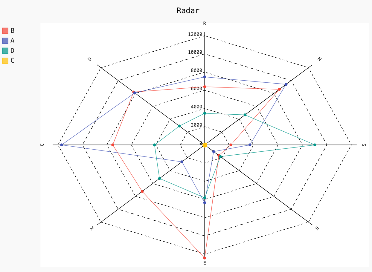
6. Radar
Radar charts are outstanding for comparing two or more groups of classes on multiple features or characteristics, and Pygal gives you the option to plot a Kiviat diagram very easily.
Let us plot a simple radar plot below:
Radar_Chart = pygal.Radar()
Radar_Chart.title = 'Radar'
Radar_Chart.x_labels = ['R', 'D', 'C', 'X', 'E', 'H', 'S', 'N']
Radar_Chart.add('B', [6392, 8211, 7521, 7228, 12434, 1640, 2143, 8637])
Radar_Chart.add('A', [7474, 8089, 11701, 2631, 6351, 1042, 3697, 9410])
Radar_Chart.add('D', [3471, 2932, 4103, 5219, 5811, 1818, 9011, 4668])
Radar_Chart.add('C', [41, 42, 58, 78, 143, 126, 31, 132])
Radar_Chart.render_to_file('Radar.svg')
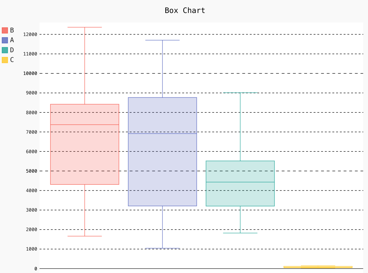
7. Box
A box plot gives you a high-level idea about the data distribution based on five factors: minimum, maximum, median, first quartile (Q1) and third quartile (Q3). In pygal, by default, you can plot a box chart having whiskers as the extremes of the dataset, and the box goes from Q1 to Q3, and the middle line represents the median of the given feature.
Let us plot a simple box chart below:
Box_Plot = pygal.Box()
Box_Plot.title = 'Box Chart'
Box_Plot.add('B', [6396, 8222, 7530, 7217, 12364, 1661, 2223, 8617])
Box_Plot.add('A', [7471, 8091, 11701, 2631, 6362, 1043, 3787, 9440])
Box_Plot.add('D', [3471, 2931, 4201, 5221, 5811, 1821, 9011, 4662])
Box_Plot.add('C', [45, 42, 56, 73, 142, 131, 31, 101])
Box_Plot.render_to_file('Box.svg')
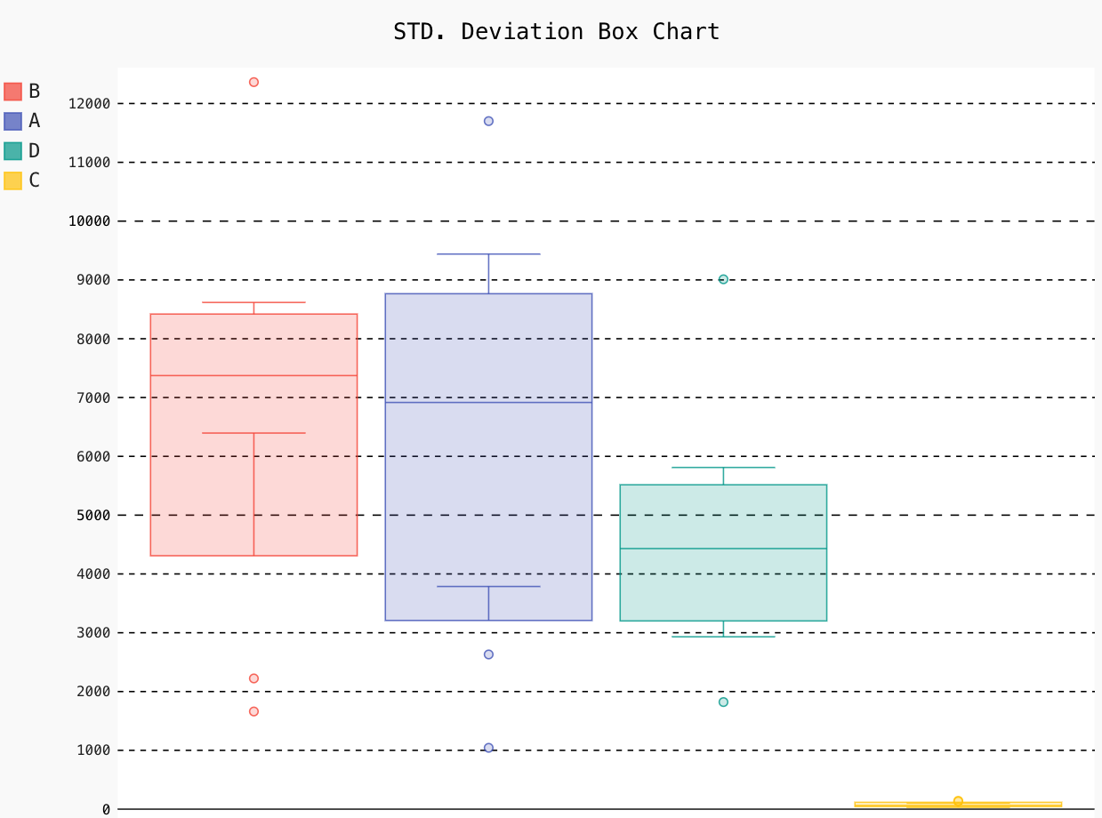
Pygal has option to change whiskers according to the standard deviation on the given feature.
Box_Plot = pygal.Box(box_mode="stdev")
Box_Plot.title = 'STD. Deviation Box Chart'
Box_Plot.add('B', [6396, 8222, 7530, 7217, 12364, 1661, 2223, 8617])
Box_Plot.add('A', [7471, 8091, 11701, 2631, 6362, 1043, 3787, 9440])
Box_Plot.add('D', [3471, 2931, 4201, 5221, 5811, 1821, 9011, 4662])
Box_Plot.add('C', [45, 42, 56, 73, 142, 131, 31, 101])
Box_Plot.render_to_file('Box_stdDev.svg')
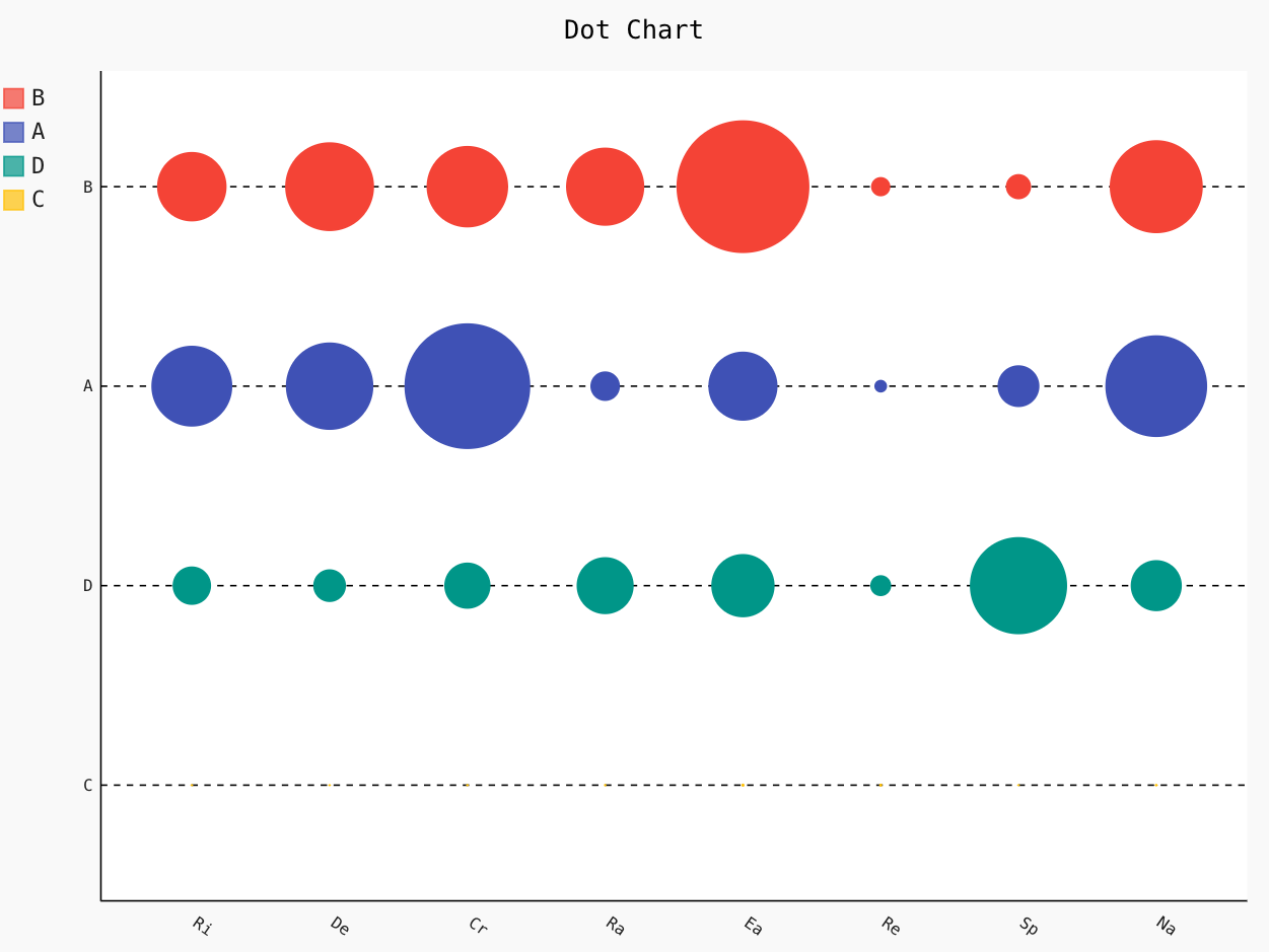
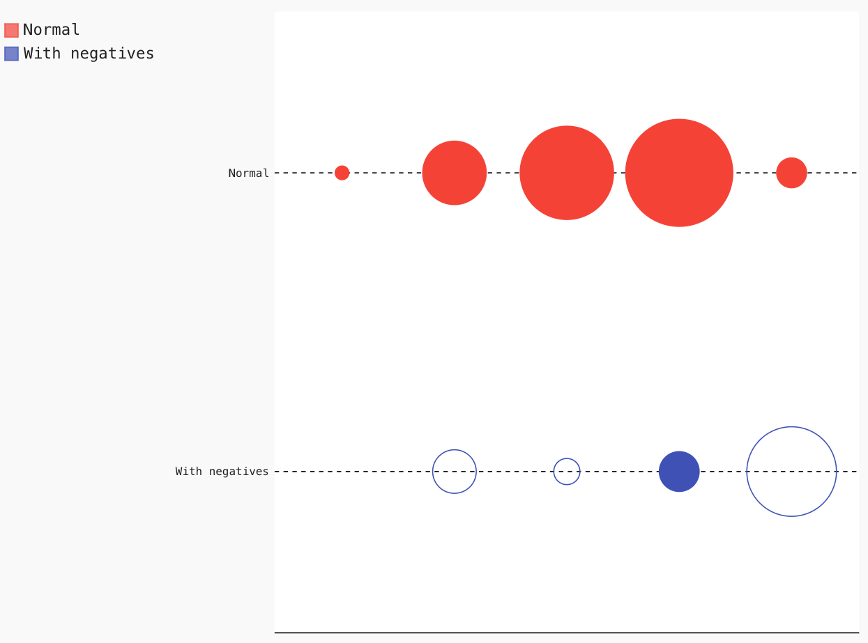
8. Dot
A simple dot or a strip plot consists of data points plotted as dots on the chart. It is helpful to check specific data trends or clustering patterns. Pygal gives you options to plot a punch card-like chart on both positive and negative data points.
Let us plot a simple dot plot below:
Dot_Chart = pygal.Dot(x_label_rotation=35)
Dot_Chart.title = 'Dot Chart'
Dot_Chart.x_labels = ['Ri', 'De', 'Cr', 'Ra', 'Ea', 'Re', 'Sp', 'Na']
Dot_Chart.add('B', [6396, 8222, 7530, 7217, 12364, 1661, 2223, 8617])
Dot_Chart.add('A', [7471, 8091, 11701, 2631, 6362, 1043, 3787, 9440])
Dot_Chart.add('D', [3471, 2931, 4201, 5221, 5811, 1821, 9011, 4662])
Dot_Chart.add('C', [45, 42, 56, 73, 142, 131, 31, 101])
Dot_Chart.render_to_file('Dot.svg')
Dot_Chart = pygal.Dot(x_label_rotation=35)
Dot_Chart.add('Normal', [11, 51, 75, 86, 24])
Dot_Chart.add('With negatives', [0, -35, -21, 32, -72])
Dot_Chart.render_to_file('Dot_Negative.svg')
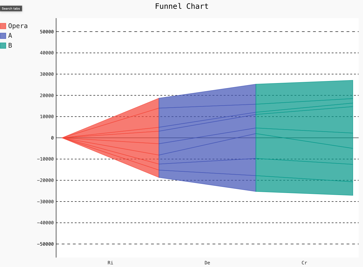
9. Funnel
Funnel plots are a great way to represent the stages of any meeting or process. Pygal helps you plot a funnel chart most easily.
Let us see how to plot a simple funnel chart below:
Funnel_Chart = pygal.Funnel()
Funnel_Chart.title = 'Funnel Chart'
Funnel_Chart.x_labels = ['Ri', 'De', 'Cr', 'Ra', 'Ea', 'Re', 'Sp', 'Na']
Funnel_Chart.add('Opera', [3478, 2833, 4233, 5329, 5910, 1838, 9023, 4679])
Funnel_Chart.add('A', [7471, 8091, 11701, 2641, 6362, 1042, 3787, 9440])
Funnel_Chart.add('B', [6391, 8211, 7521, 7211, 12463, 1661, 2124, 8609])
Funnel_Chart.render_to_file('Funnel.svg')
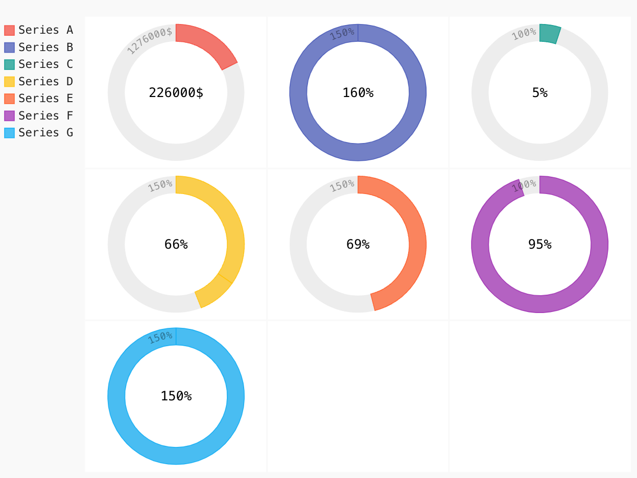
10. Solid Gauge
Solid Gauge charts are the most popular angular Gauge charts used for real-world Gauges or dashboards as they can visualize a number in a range at a glance.
Lets us plot a simple SolidGauge plot using Pygal below:
Gauge = pygal.SolidGauge(inner_radius=0.75)
per_format = lambda x: '{:.10g}%'.format(x)
dol_format = lambda x: '{:.10g}$'.format(x)
Gauge.value_formatter = per_format
Gauge.add('Series A', [{'value': 226000, 'max_value': 1276000}],
formatter= dol_format)
Gauge.add('Series B', [{'value': 160, 'max_value': 150}])
Gauge.add('Series C', [{'value': 5}])
Gauge.add(
'Series D', [
{'value': 52, 'max_value': 150},
{'value': 14, 'max_value': 150}])
Gauge.add('Series E', [{'value': 69, 'max_value': 150}])
Gauge.add('Series F', 95)
Gauge.add('Series G', [{'value': 150, 'max_value': 150}])
Gauge.render_to_file('SolidGauge.svg')
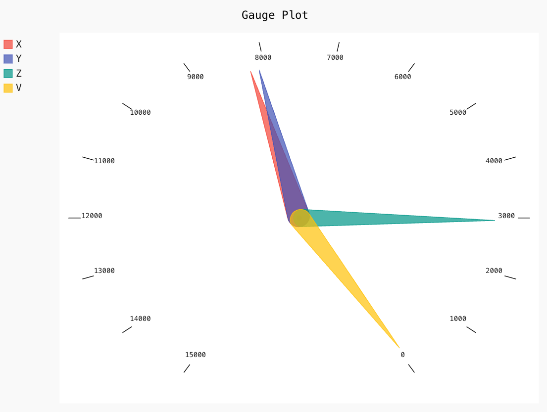
11. Gauge
A Gauge plot is a type of plot that is most commonly used for a single data value with a quantitative context, and it tracks the progress of a KPI.
Let us plot a simple Gauge chart using Pygal below:
Gauge_chart = pygal.Gauge(human_readable=True)
Gauge_chart.title = 'Gauge Plot'
Gauge_chart.range = [0, 15000]
Gauge_chart.add('X', 8219)
Gauge_chart.add('Y', 8091)
Gauge_chart.add('Z', 2953)
Gauge_chart.add('V', 42)
Gauge_chart.render_to_file('Gauge.svg')
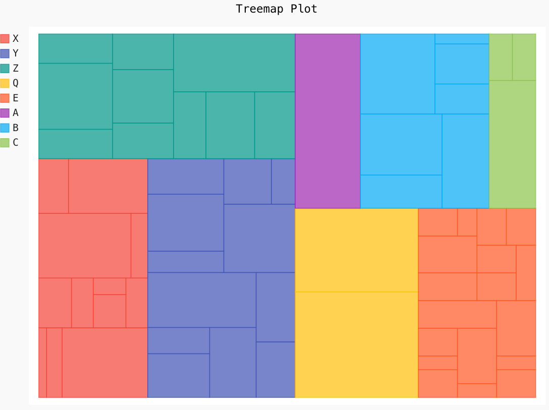
12. Treemap
Treemap is an essential chart that provides a hierarchical view of the data and often shows sales data.
Let us plot a simple Treemap using Pygal below:
Treemap = pygal.Treemap()
Treemap.title = 'Treemap Plot'
Treemap.add('X', [1, 2, 11, 3, 2, 2, 1, 2, 11, 2 , 3, None, 8])
Treemap.add('Y', [5, 3, 6, 11, 4, 5, 3, 8, 5, -11, None, 9, 4, 2])
Treemap.add('Z', [4, 9, 4, 4, 6, 4, 4, 6, 5, 13])
Treemap.add('Q', [24, 19])
Treemap.add('E', [2, 1, 2, 1, 4, 4, 2, 1, 4,
3, 4, 2, 1, 2, 2, 2, 2, 2])
Treemap.add('A', [21])
Treemap.add('B', [5, 9.2, 8.2, 11, 3, 4, 1])
Treemap.add('C', [11, 2, 2])
Treemap.render_to_file('Treemap.svg')
13. Maps
Maps display the symbolic representation and relationship between different regions or countries. Pygal provides options to plot World Map, French Map, and Swiss Map. The maps are now packaged separately to keep the pygal package small in size, and below is the link to install and configure them according to your project.
https://www.pygal.org/en/stable/documentation/types/maps/index.html
Some Additional Features
Apart from different styles of charts, it also provides some extra features that we will discuss below.
However, the implementation of each feature is not within the scope of this guide. Hence it is recommended to check out the official documentation page.
- Styles: Pygal provides users with different options to style their graphs and charts. There are built-in styles to change the charts’ color pattern like Neon, Red, Blue, Turquoise, Dark Green, Light Solarized, etc. You can also import custom CSS styles to use in your chart.
- Chart Configurations: It also provides you options to change the configurations of the chart, like changing the titles, x-labels, y-labels, sizing, legends, axis, data, and much more.
- Embedding In A Web Page: It provides options to set up URL entries for your saved SVG chart to put tags in your HTML code.
Conclusion
In this guide, we discussed an open-source data visualization library, Pygal. We have seen different types of charts that can be implemented. Furthermore, the must-known features and comparisons with other Python-based data visualization libraries are also explained in this guide. I hope the underlined benefits and importance of the Pygal Data Visualization library were clear to help you make decisions.
Now, I would love to see how you people will use Pygal in your project. Don’t forget to like, share and comment if you learned something valuable today.
The media shown in this article is not owned by Analytics Vidhya and is used at the Author’s discretion.
Data Scientist and a Technical Writer! I will give you the best of Open-Source and AI.
Talks about #chatgpt, #opensource, #contentcreation, #communitybuilding, and #artificialintelligence
Technical Writer | Data Science, ML, AI, Open-Source | Do More with Data - Litmus


