Welcome to the world of data science! Data science is the art of using data to find answers and draw meaningful insights. But how do we do that reliably? The secret sauce is statistics. It’s the powerful framework that allows us to move beyond simple observations to make confident, data-driven decisions. Whether you’re building a machine learning model or presenting findings to your team, a strong statistical foundation is non-negotiable. In this article, we will learn all the important statistical concepts that are required for Data Science roles.
Table of contents
1. Difference between Parameter and Statistic
Imagine you’re cooking a large pot of soup. The entire pot is your population. It’s the complete group you’re interested in, whether it’s all your app users or every home in a city. Since you can’t possibly test the whole pot, you take a spoonful to taste. That spoonful is your sample: a smaller, manageable subset of the population that you collect data from. The core idea is that by carefully analyzing the sample, we can make an educated guess about the entire population without having to study every single member.
A parameter is a number that describes the data from the population. And a statistic is a number that describes the data a Continuing our soup analogy, a parameter is the true value that describes the entire population. It’s the exact, real average saltiness of the whole pot of soup, a value we might never know perfectly. In data science, this could be the true average spending of all customers. A statistic, on the other hand, is a number that describes your sample. It’s the saltiness you measured in your spoonful. We use this statistic to make an educated guess about the population’s parameter.
2. Statistics and Its Types
Statistics is a discipline that concerns the collection, organization, analysis, interpretation, and presentation of data.
It means, as part of statistical analysis, we collect, organize, and draw meaningful insights from the data either through visualizations or mathematical explanations.
Statistics is broadly categorized into two types:
- Descriptive Statistics
- Inferential Statistics
Descriptive Statistics:
As the name suggests, in Descriptive statistics, we describe the data using the Mean, Standard deviation, Charts, or Probability distributions.
Basically, as part of descriptive Statistics, we measure the following:
- Frequency: no. of times a data point occurs
- Central tendency: the centrality of the data – mean, median, and mode
- Dispersion: the spread of the data – range, variance, and standard deviation
- The measure of position: percentiles and quantile ranks
Inferential Statistics:
In Inferential statistics, we estimate the population parameters. Or we run Hypothesis testing to assess the assumptions made about the population parameters.
In simple terms, we interpret the meaning of the descriptive statistics by applying them to the population.
For example, we are conducting a survey on the number of two-wheelers in a city. Assume the city has a total population of 5L people. So, we take a sample of 1000 people, as it is impossible to run an analysis on the entire population data.
From the survey conducted, it is found that 800 people out of 1000 (800 out of 1000 is 80%) are two-wheelers. So, we can infer these results to the population and conclude that 4L people out of the 5L population are two-wheelers.
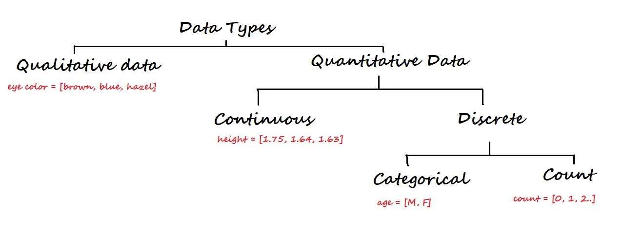
3. Data Types and Level of Measurement
At a higher level, data is categorized into two types: Qualitative and Quantitative.
Qualitative data is non-numerical. Some of the examples are eye colour, car brand, city, etc.
On the other hand, Quantitative data is numerical, and it is again divided into Continuous and Discrete data.
- Continuous data: It can be represented in decimal format. Examples are height, weight, time, distance, etc.
- Discrete data: It cannot be represented in decimal format. Examples are the number of laptops and, number of students in a class.
Discrete data is again divided into Categorical and Count Data.
- Categorical data: Represents the type of data that can be divided into groups. Examples are age, sex, etc.
- Count data: This data contains non-negative integers. Example: the number of children a couple has.
Level of Measurement
In statistics, the level of measurement is a classification that describes the relationship between the values of a variable.
We have four fundamental levels of measurement. They are:
- Nominal Scale
- Ordinal Scale
- Interval Scale
- Ratio Scale
1. Nominal Scale: This scale contains the least information since the data have names/labels only. It can be used for classification. We cannot perform mathematical operations on nominal data because there is no numerical value to the options (numbers associated with the names can only be used as tags).
Example: Which country do you belong to? India, Japan, Korea.
2. Ordinal Scale: In comparison to the nominal scale, the ordinal scale has more information because, along with the labels, it has order/direction.
Example: Income level – High income, medium income, low income.
3. Interval Scale: It is a numerical scale. The Interval scale has more information than the nominal, ordinal scales. Along with the order, we know the difference between the two variables (interval indicates the distance between two entities).
Mean, median, and mode can be used to describe the data.
Example: Temperature, income, etc.
4. Ratio Scale: The ratio scale has the most information about the data. Unlike the other three scales, the ratio scale can accommodate a true zero point. The ratio scale is simply said to be the combination of Nominal, Ordinal, and Interval scales.
Example: Current weight, height, etc.
4. Moments of Business Decision
We have four moments of business decisions that help us understand the data.
4.1. Measures of Central Tendency
(It is also known as the First Moment of Business Decision)
Talks about the centrality of the data. To keep it simple, it is a part of descriptive statistical analysis where a single value at the centre represents the entire dataset.
The central tendency of a dataset can be measured using:
- Mean: It is the sum of all the data points divided by the total number of values in the data set. The mean cannot always be relied upon because it is influenced by outliers.
- Median: It is the middlemost value of a sorted/ordered dataset. If the size of the dataset is even, then the median is calculated by taking the average of the two middle values.
- Mode: It is the most repeated value in the dataset. Data with a single mode is called unimodal, data with two modes is called bimodal, and data with more than two modes is called multimodal.
4.2. Measures of Dispersion
(It is also known as the Second Moment Business Decision)
Talks about the spread of data from its centre.
Dispersion can be measured using:
- Variance: It is the average squared distance of all the data points from their mean. The problem with Variance is, the units will also get squared.
- Standard Deviation: It is the square root of Variance. Helps in retrieving the original units.
- Range: It is the difference between the maximum and the minimum values of a dataset.
Measure |
Population |
Sample |
|---|---|---|
| Mean | µ = (Σ Xi)/N | x̄ = (Σ xi)/n |
| Median | The middle value of the data | The middle value of the data |
| Mode | Most occurred value | Most occurred value |
| Variance | σ2 = (Σ Xi – µ)2/N | s2 = (Σ xi – x̄)2/ (n-1) |
| Standard Deviation | σ = sqrt((Σ Xi – µ)2/N) | s = sqrt((Σ xi – x̄)2/ (n-1)) |
| Range | Max-Min | Max-Min |
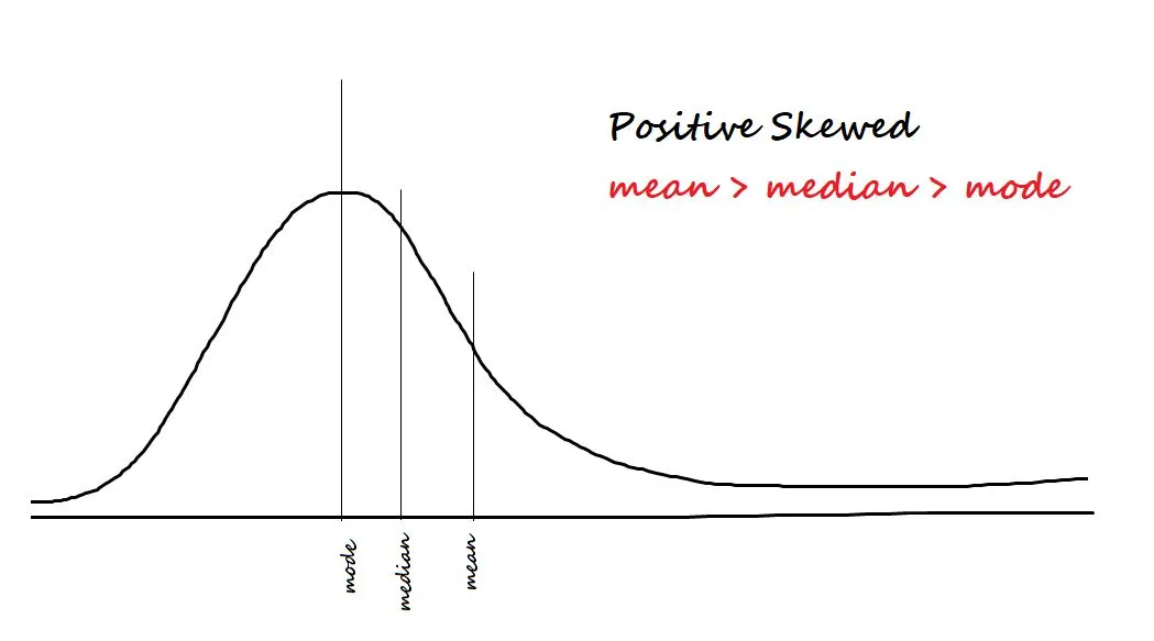
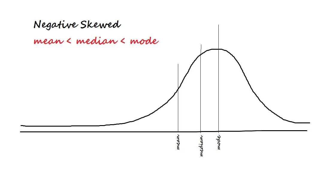
4.3. Skewness
(It is also known as the Third Moment Business Decision)
It measures the asymmetry in the data. The two types of Skewness are:
- Positive/right-skewed: Data is said to be positively skewed if most of the data is concentrated on the left side and has a tail towards the right.
- Negative/left-skewed: Data is said to be negatively skewed if most of the data is concentrated on the right side and has a tail towards the left.
The formula of Skewness is E [(X – µ)/ σ ]) 3 = Z3
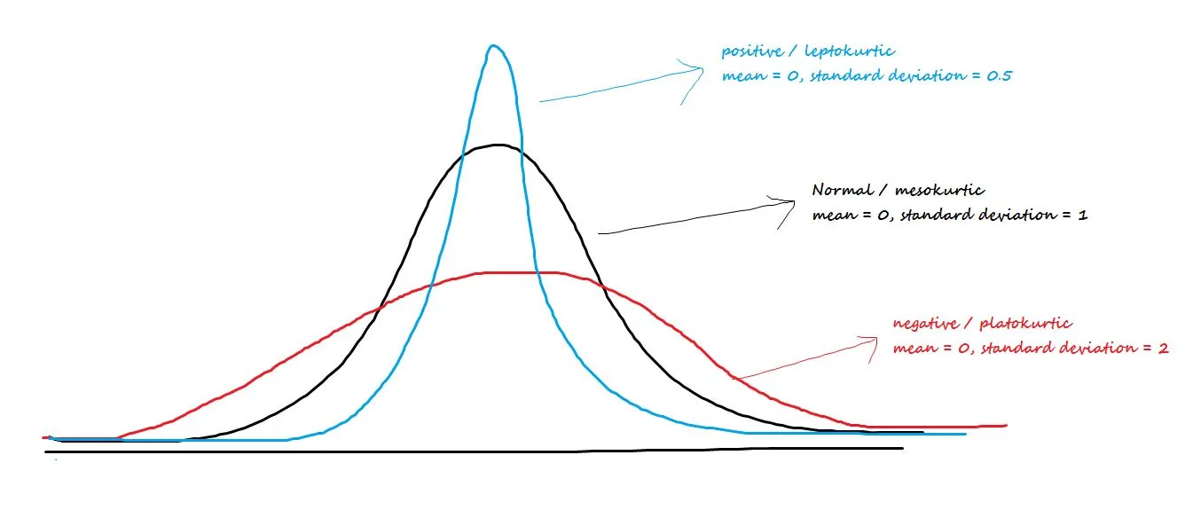
4.4. Kurtosis
(It is also known as Fourth Moment Business Decision)
Talks about the central peakedness or fatness of tails. The three types of Kurtosis are:
- Positive/leptokurtic: Has sharp peaks and lighter tails
- Negative/Platokurtic: Has wide peaks and thicker tails
- MesoKurtic: Normal distribution
The formula of Kurtosis is E [(X – µ)/ σ ]) 4-3 = Z4– 3
Together, Skewness and Kurtosis are called Shape Statistics.
5. Central Limit Theorem (CLT)
Instead of analyzing the entire population data, we always take out a sample for analysis. The problem with sampling is that “sample means are a random variable – they vary for different samples”. And the random sample we draw can never be an exact representation of the population. This phenomenon is called sample variation.
To nullify the sample variation, we use the central limit theorem. And according to the Central Limit Theorem:
- The distribution of sample means follows a normal distribution if the population is normal.
- The distribution of sample means follows a normal distribution even though the population is not normal. But the sample size should be large enough.
- The grand average of all the sample mean values gives us the population mean.
6. Probability distributions
In statistical terms, a distribution is a function that shows the possible values for a variable and how often they occur. Understanding the most common distributions is like having a toolkit for describing different types of real-world phenomena.
While there are many distributions, a data scientist should be very familiar with these three:
- The Poisson Distribution: This distribution is used to model the number of times an event happens over a fixed interval of time or space. It’s useful when you know the average rate of the event, and you want to know the likelihood of a different number of events occurring. For example: “If a call center receives an average of 10 calls per hour, what is the probability they will receive 15 calls in the next hour?” or “If a book has an average of one typo per 10 pages, what is the probability of finding three typos on a single page?”
- The Normal Distribution (The “Bell Curve”): This is the most famous distribution. It’s symmetrical and bell-shaped, and it’s used to model continuous data where most values cluster around a central average. Think of things like human height, blood pressure, or test scores. Most people are “average,” with fewer and fewer people at the extreme ends (very short/tall, very low/high scores).
- The Binomial Distribution: This distribution is used when you have a fixed number of trials, and each trial has only two possible outcomes (like “success/failure” or “heads/tails”). It helps you calculate the probability of getting a certain number of successes. For example, you could use it to answer: “If I flip a coin 10 times, what is the probability of getting exactly 7 heads?”.
To learn more about probability distributions, read this article.
7. Graphical representations
Graphical representation refers to the use of charts or graphs to visualize, analyze, and interpret numerical data.
For a single variable (Univariate analysis), we have a bar plot, line plot, frequency plot, dot plot, boxplot, and the Normal Q-Q plot.
We will be discussing the Boxplot and the Normal Q-Q plot.
7.1. Boxplot
A boxplot is a way of visualizing the distribution of data based on a five-number summary. It is used to identify the outliers in the data.
The five numbers are minimum, first Quartile (Q1), median (Q2), third Quartile (Q3), and maximum.
The box region will contain 50% of the data. The lower 25% of the data region is called the Lower Whisker, and the upper 25% of the data region is called the Upper Whisker.
The Interquartile range (IQR) is the difference between the third and first quartiles. IQR = Q3 – Q1.
Outliers are the data points that lie below the lower whisker and beyond the upper whisker.
The formula to find the outliers is Outlier = Q ± 1.5*(IQR)
The outliers that lie below the lower whisker are given as Q1 – 1.5 * (IQR)
The outliers that lie beyond the upper whisker are given as Q3 + 1.5 * (IQR)

Check out my article on detecting outliers using a boxplot.
7.2. Normal Q-Q plot
A Normal Q-Q plot is a kind of scatter plot that is plotted by creating two sets of quantiles. It is used to check if the data follows normality or not.
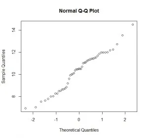
On the x-axis, we have the Z-scores, and on the y-axis, we have the actual sample quantiles. If the scatter plot forms a straight line, the data is said to be normal.
8. Hypothesis Testing
Hypothesis testing in statistics is a formal way to test an assumption we have made about a population. Think of it as the scientific method for data: you have a theory, and you need to see if the data supports it. The process feels a lot like a courtroom trial.
The Core Idea: In a trial, the defendant is “innocent until proven guilty.” In hypothesis testing, we have a “status quo” idea that we assume is true until our data provides enough evidence to convince us otherwise.
Here are the key players:
- The Null Hypothesis (H₀): This is the “innocent” assumption, the status quo. It represents the idea that there is no effect or no difference. For example: “This new drug does not affect recovery time,” or “The average customer spending has not changed.”
- The Alternative Hypothesis (H₁): This is the claim you want to prove—the prosecutor’s case. It represents the idea that there is an effect or a difference. For example: “This new drug shortens recovery time,” or “The average customer spending has increased.”
- The p-value: This is your “strength of evidence.” The p-value is the probability of observing your data (or something even more extreme) if the null hypothesis were true.
- A low p-value (typically < 0.05) means: “It’s very unlikely I would see this data if the drug had no effect. Therefore, I have strong evidence against the null hypothesis.” You can reject the null hypothesis.
- A high p-value (typically > 0.05) means: “This data is quite plausible even if the drug had no effect. I don’t have enough evidence to make a new claim.” You fail to reject the null hypothesis.
To learn more about hypothesis testing, read this article.
9. Confidence Intervals
When we calculate a statistic from a sample (like the sample mean), we know it’s just an estimate of the true population parameter. If we took a different sample, we’d get a slightly different mean. A confidence interval gives us a way to deal with this uncertainty.
Instead of a single-number estimate (a “point estimate”), a confidence interval provides a range of plausible values for the population parameter.
For example, instead of saying, “Based on our sample, the average customer satisfaction score is 8.2,” we can say:
“We are 95% confident that the true average customer satisfaction score for all customers is between 7.9 and 8.5.”
This is much more powerful. The 95% confidence level means that if we were to repeat our sampling process 100 times and create 100 intervals, we would expect about 95 of those intervals to contain the true population mean. It tells us how reliable our estimation method is.
10. Correlation
So far, we have mostly discussed analyzing a single variable (univariate analysis). However, much of data science is about understanding the relationship between variables. The simplest measure of this is correlation.
Correlation measures the strength and direction of a linear relationship between two quantitative variables. The result is a correlation coefficient, a number that is always between -1 and +1.
- No Correlation (Value ≈ 0): There is no linear relationship between the variables.
- Positive Correlation (Value > 0): When one variable increases, the other variable tends to increase. (e.g., The more hours you study, the higher your test score tends to be). A value of +1 represents a perfect positive linear relationship.
- Negative Correlation (Value < 0): When one variable increases, the other variable tends to decrease. (e.g., The more miles you drive, the less fuel you have in your tank.) A value of -1 represents a perfect negative linear relationship.
Conclusion
Think of these concepts not as separate rules to memorize, but as a connected toolkit. You now have the tools not just to describe what your data looks like (with means and standard deviations), but to ask it meaningful questions (with hypothesis tests) and understand the relationships hiding inside (with correlation).
This isn’t just about crunching numbers; it’s about building intuition and telling a compelling story with data. The journey doesn’t end here. This foundation is your launchpad into the exciting world of machine learning.
This article was published as part of the Data Science Blogathon
The media shown in this article are not owned by Analytics Vidhya and are used at the Author’s discretion.
Hi, my name is Harika. I am a Data Engineer and I thrive on creating innovative solutions and improving user experiences. My passion lies in leveraging data to drive innovation and create meaningful impact.


