Cookies
This site uses cookies to ensure that you get the best experience possible. To learn more about how we use cookies, please refer to our Privacy Policy & Cookies Policy.
brahmaid
It is needed for personalizing the website.
csrftoken
This cookie is used to prevent Cross-site request forgery (often abbreviated as CSRF) attacks of the website
Identityid
Preserves the login/logout state of users across the whole site.
sessionid
Preserves users' states across page requests.
g_state
Google One-Tap login adds this g_state cookie to set the user status on how they interact with the One-Tap modal.
MUID
Used by Microsoft Clarity, to store and track visits across websites.
_clck
Used by Microsoft Clarity, Persists the Clarity User ID and preferences, unique to that site, on the browser. This ensures that behavior in subsequent visits to the same site will be attributed to the same user ID.
_clsk
Used by Microsoft Clarity, Connects multiple page views by a user into a single Clarity session recording.
SRM_I
Collects user data is specifically adapted to the user or device. The user can also be followed outside of the loaded website, creating a picture of the visitor's behavior.
SM
Use to measure the use of the website for internal analytics
CLID
The cookie is set by embedded Microsoft Clarity scripts. The purpose of this cookie is for heatmap and session recording.
SRM_B
Collected user data is specifically adapted to the user or device. The user can also be followed outside of the loaded website, creating a picture of the visitor's behavior.
_gid
This cookie is installed by Google Analytics. The cookie is used to store information of how visitors use a website and helps in creating an analytics report of how the website is doing. The data collected includes the number of visitors, the source where they have come from, and the pages visited in an anonymous form.
_ga_#
Used by Google Analytics, to store and count pageviews.
_gat_#
Used by Google Analytics to collect data on the number of times a user has visited the website as well as dates for the first and most recent visit.
collect
Used to send data to Google Analytics about the visitor's device and behavior. Tracks the visitor across devices and marketing channels.
AEC
cookies ensure that requests within a browsing session are made by the user, and not by other sites.
G_ENABLED_IDPS
use the cookie when customers want to make a referral from their gmail contacts; it helps auth the gmail account.
test_cookie
This cookie is set by DoubleClick (which is owned by Google) to determine if the website visitor's browser supports cookies.
_we_us
this is used to send push notification using webengage.
WebKlipperAuth
used by webenage to track auth of webenagage.
ln_or
Linkedin sets this cookie to registers statistical data on users' behavior on the website for internal analytics.
JSESSIONID
Use to maintain an anonymous user session by the server.
li_rm
Used as part of the LinkedIn Remember Me feature and is set when a user clicks Remember Me on the device to make it easier for him or her to sign in to that device.
AnalyticsSyncHistory
Used to store information about the time a sync with the lms_analytics cookie took place for users in the Designated Countries.
lms_analytics
Used to store information about the time a sync with the AnalyticsSyncHistory cookie took place for users in the Designated Countries.
liap
Cookie used for Sign-in with Linkedin and/or to allow for the Linkedin follow feature.
visit
allow for the Linkedin follow feature.
li_at
often used to identify you, including your name, interests, and previous activity.
s_plt
Tracks the time that the previous page took to load
lang
Used to remember a user's language setting to ensure LinkedIn.com displays in the language selected by the user in their settings
s_tp
Tracks percent of page viewed
AMCV_14215E3D5995C57C0A495C55%40AdobeOrg
Indicates the start of a session for Adobe Experience Cloud
s_pltp
Provides page name value (URL) for use by Adobe Analytics
s_tslv
Used to retain and fetch time since last visit in Adobe Analytics
li_theme
Remembers a user's display preference/theme setting
li_theme_set
Remembers which users have updated their display / theme preferences
We do not use cookies of this type.
_gcl_au
Used by Google Adsense, to store and track conversions.
SID
Save certain preferences, for example the number of search results per page or activation of the SafeSearch Filter. Adjusts the ads that appear in Google Search.
SAPISID
Save certain preferences, for example the number of search results per page or activation of the SafeSearch Filter. Adjusts the ads that appear in Google Search.
__Secure-#
Save certain preferences, for example the number of search results per page or activation of the SafeSearch Filter. Adjusts the ads that appear in Google Search.
APISID
Save certain preferences, for example the number of search results per page or activation of the SafeSearch Filter. Adjusts the ads that appear in Google Search.
SSID
Save certain preferences, for example the number of search results per page or activation of the SafeSearch Filter. Adjusts the ads that appear in Google Search.
HSID
Save certain preferences, for example the number of search results per page or activation of the SafeSearch Filter. Adjusts the ads that appear in Google Search.
DV
These cookies are used for the purpose of targeted advertising.
NID
These cookies are used for the purpose of targeted advertising.
1P_JAR
These cookies are used to gather website statistics, and track conversion rates.
OTZ
Aggregate analysis of website visitors
_fbp
This cookie is set by Facebook to deliver advertisements when they are on Facebook or a digital platform powered by Facebook advertising after visiting this website.
fr
Contains a unique browser and user ID, used for targeted advertising.
bscookie
Used by LinkedIn to track the use of embedded services.
lidc
Used by LinkedIn for tracking the use of embedded services.
bcookie
Used by LinkedIn to track the use of embedded services.
aam_uuid
Use these cookies to assign a unique ID when users visit a website.
UserMatchHistory
These cookies are set by LinkedIn for advertising purposes, including: tracking visitors so that more relevant ads can be presented, allowing users to use the 'Apply with LinkedIn' or the 'Sign-in with LinkedIn' functions, collecting information about how visitors use the site, etc.
li_sugr
Used to make a probabilistic match of a user's identity outside the Designated Countries
MR
Used to collect information for analytics purposes.
ANONCHK
Used to store session ID for a users session to ensure that clicks from adverts on the Bing search engine are verified for reporting purposes and for personalisation
We do not use cookies of this type.
Cookie declaration last updated on 24/03/2023 by Analytics Vidhya.
Cookies are small text files that can be used by websites to make a user's experience more efficient. The law states that we can store cookies on your device if they are strictly necessary for the operation of this site. For all other types of cookies, we need your permission. This site uses different types of cookies. Some cookies are placed by third-party services that appear on our pages. Learn more about who we are, how you can contact us, and how we process personal data in our Privacy Policy.
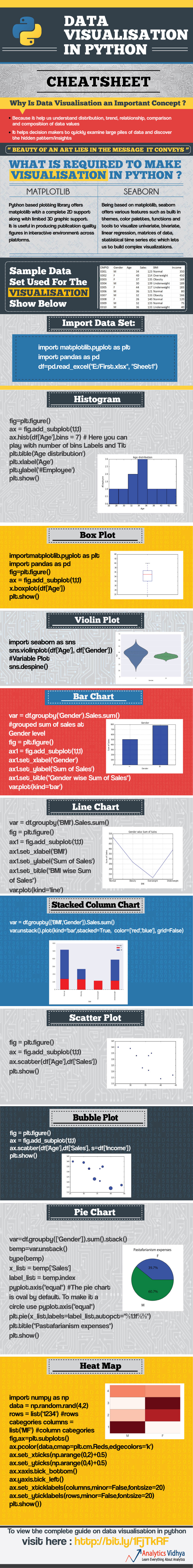


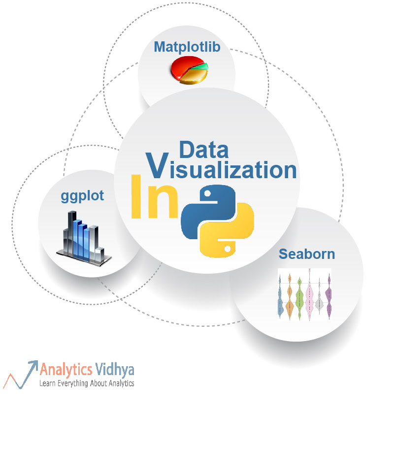
Have a look at PyGal and GGPlot as well for visualization.
Hi Its an amazing post. I was wondering if we have a good library to create motion charts in Python. Thanks
[…] We are want to say thanks if you like to share this post to another people via your Facebook, Pinterest, Google Plus or Twitter account. To save infographic right click on this or tab and hold for seven seconds if you are using iPad or iPhone. Full size is 736X5991 Link to full-size image pixels. The source of this magnificent design from analyticsvidhya.com […]