This article was published as a part of the Data Science Blogathon
Introduction
A Pandas dataframe is represented in a tabular format with rows and columns. It is very similar to the excel display of data in sheets. The significant difference between Pandas dataframe and excel is that in Pandas, you cannot directly make modifications to the dataset. Neither you can sort the data via any GUI, nor create quick visualizations by selecting some parameters.
In excel, you can do all these things but what if I tell you that you can do all these things in GUI in Pandas also and get the code for all the modifications and plotting done too! D-Tale is a powerpack library that offers such features along with loads of additional benefits. I will try to capture all the features of this library.

About D-Tale and Startup options
As the name suggests, D-Tale presents a variety of details about the data provided. It supports a wide range of file formats including CSV, TSV, XLS, XLSX. It is a Python library built with Flask backend and React as the frontend. It can be easily installed via pip python package manager.
pip install dtale
There are two ways in which you can start a D-Tale interface and load the data in Jupyter notebooks:
- Either pass the dataframe object to the D-Tale function. This instantiates the GUI within the Jupyter cell only.
- Initialize the D-Tale interface without passing the dataframe. It will show up an interaction menu with the GUI to load the data and provide various other options too.
For a better demonstration, I will be opting for the 2nd option. The code to start the instance without data is:
import dtale
dtale.show(open_browser=True)
As soon as you run this code, you will get this GUI menu:
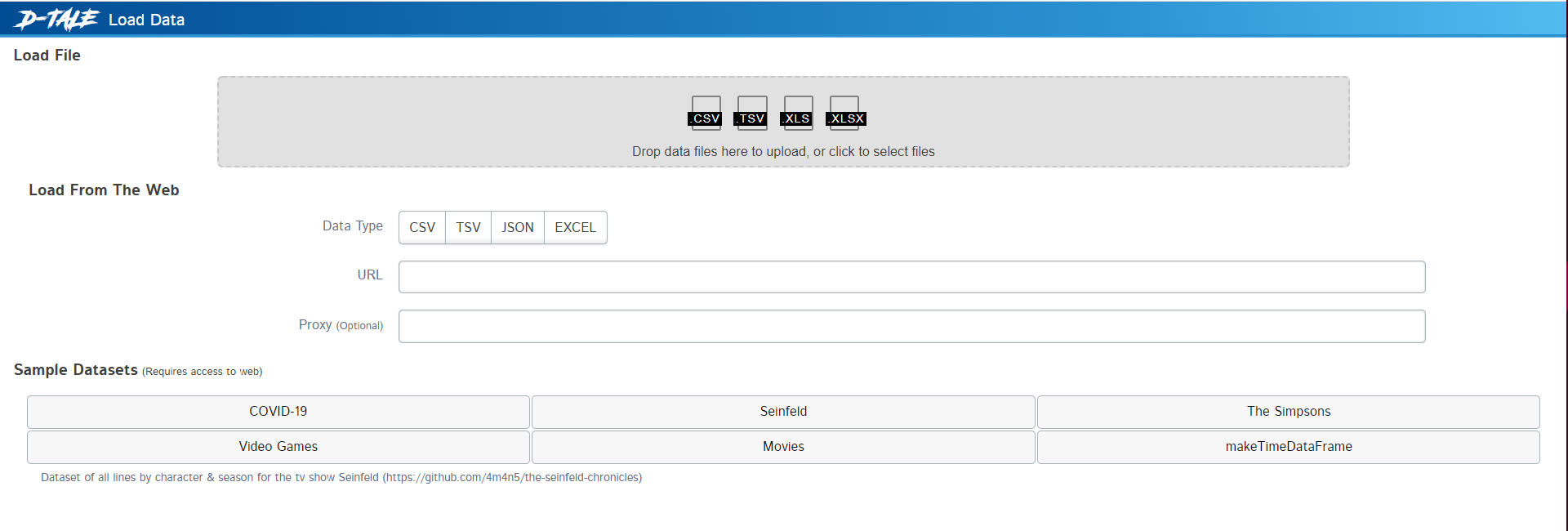
First-time interface
Here you have the following options –
- Loading data from a file
- Loading data from websites. Here you need to pass the link of the website from where you can fetch files such as CSV, JSON, TSV, or Excel.
- Loading sample datasets. These datasets may require some background downloading to fetch the datasets from the server.
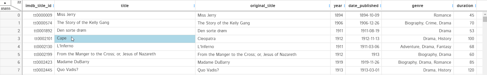
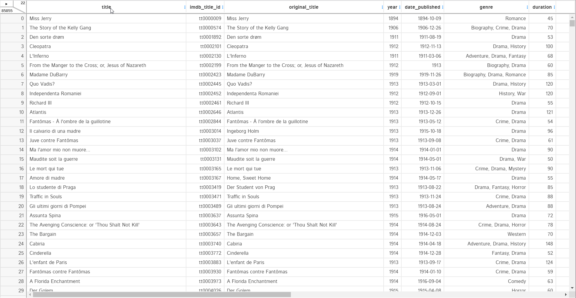
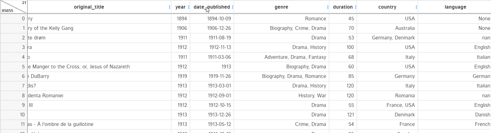
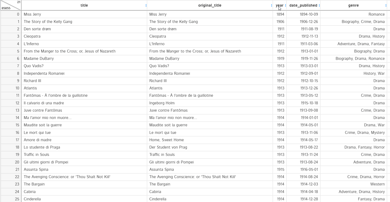
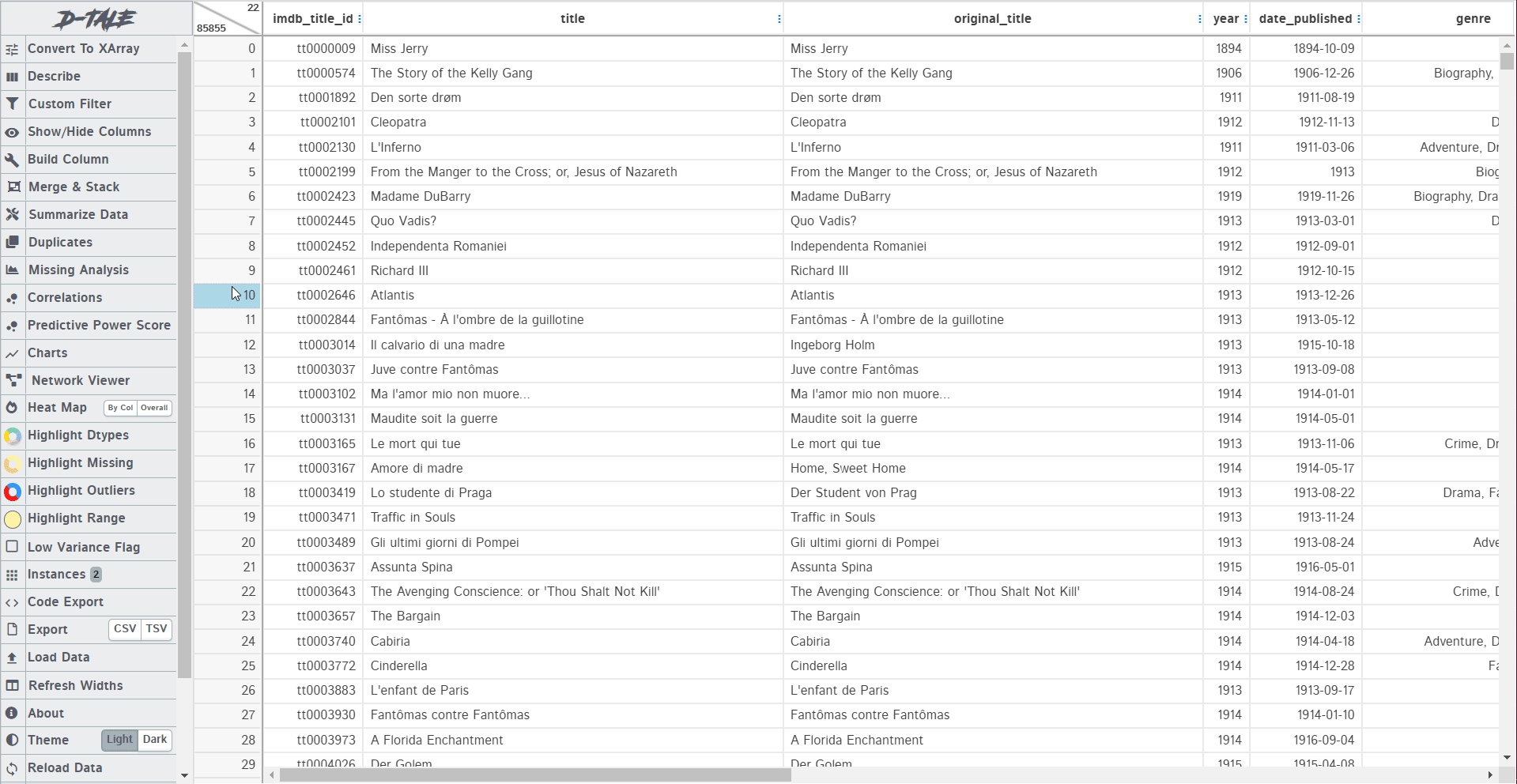
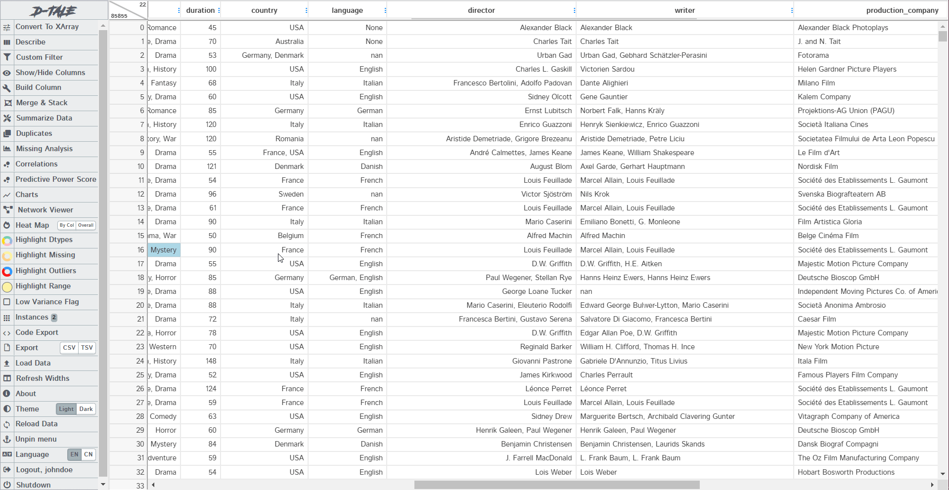
Let’s load the Movies Sample datasets. As soon as you load the dataset, a table will be displayed just like the pandas dataframe. All the cells of this table can be edited and you can make direct changes to the values just like in excel.
Column Menu Functions
Whenever you click on the column header, you will get a list of options depending upon the type of data the column contains. The common thing in all three of them is sorting by Ascending or Descending order. Other than that, there would be different filter approaches for different types of data.
Also, in the string type column, there would be no “heat map” and “Variance Report” option but there will be a new option called “Clean Columns” which is not present in integer and datetime value column.
Let’s explore some of them.
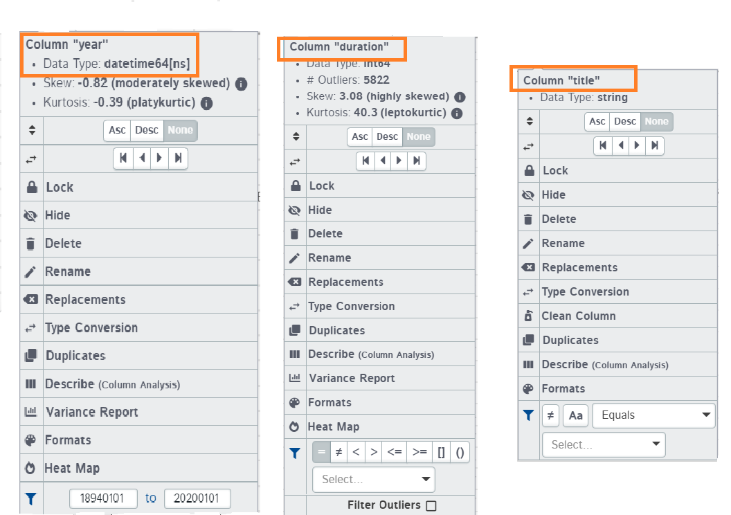
1. Lock
The lock option sticks the column to the left of the screen allowing you to freely scroll/navigate to other columns without the locked column being displaced. This can prove useful in cases when you want to have a look at columns that are placed apart.
2. Hide and Delete
The hide option removes the column from the dataframe view. It is not deleted from the actual dataframe. You can simply unhide the column from the top right strip.
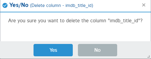
The delete option will remove the column from the dataframe permanently. It is similar to the pandas drop function. In the backend, it is iterating over the list of columns to select the column to delete from the dataframe.
3. Replacements and Type conversion
A replacement option is used for replacing some values of the column with a constant or nan value. You can make this replacement in place or create a separate column. Replacement type can also be defined as replacing: specific values, spaces, or specific string replacement.
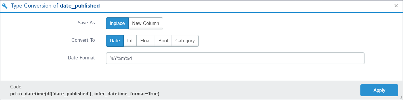
For example, the “date_published” column should contain all the date-type strings but there is a text “TV Movie 2019” which is not supposed to be present. Let’s replace this text with numpy nan.
Now, I can easily change the data type of the “date_published” column from string to datetime using the Type conversion option. It also provides an option for making the change in place or another column:
4. Describe
The describe function in pandas helps in providing a statistical summary of the column or the dataset. The describe option here works in the same way but it provides way more information than the normal pandas functions. As it is named column analysis, it provides a unique summary for each data type.
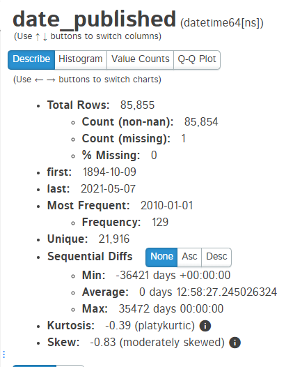
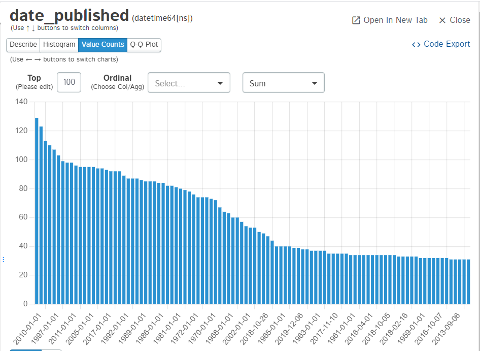
For a datetime type column, it provides the following details:
It also generates histogram and value_counts graph for the features:
For integer type columns, it provides measures of centrality and spread along with the frequency of most frequent value along with Kurtosis and Skewness. It also represents the data in the box plot, histogram, value_count plot, and Q-Q plot.
For string type columns, it provides the most frequent word and its frequency, detailed summary on characters present, word value count plot, and value counts plot.
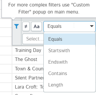
5. Filters
These are used to make a subset of the data. Filtering data in D-Tale is very easy and you just need to specify the type of filters you want. The example below shows filtering dataset by year > 2000 and year == 2001:
You can filter data by date range too when filtering data in datetime type columns. For string type columns, you can filter data by:
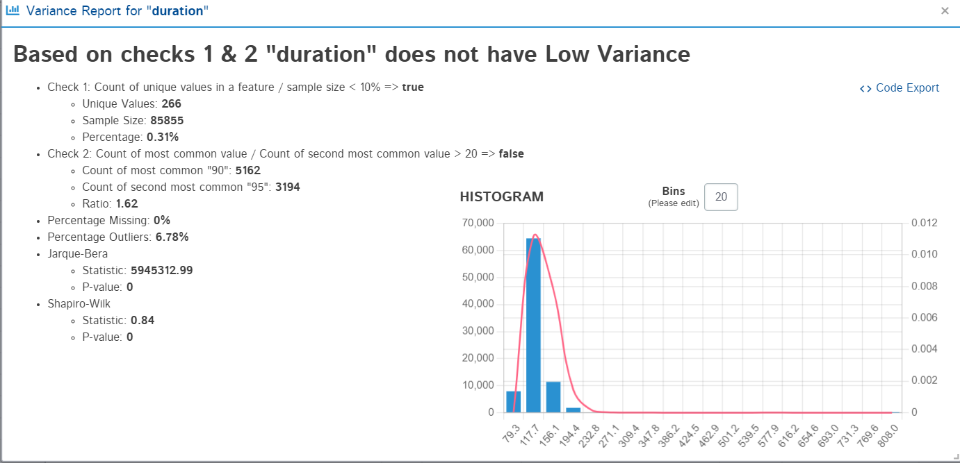
6. Variance Report
This option is not available for string-type values. Variance report shows whether the feature has low variance or not. It decides this based on two checks:
- Count of unique values in a feature / sample size < 10%
- Count of most common value / Count of second most common value > 20
It displays the result with the calculations and a histogram to present the findings.
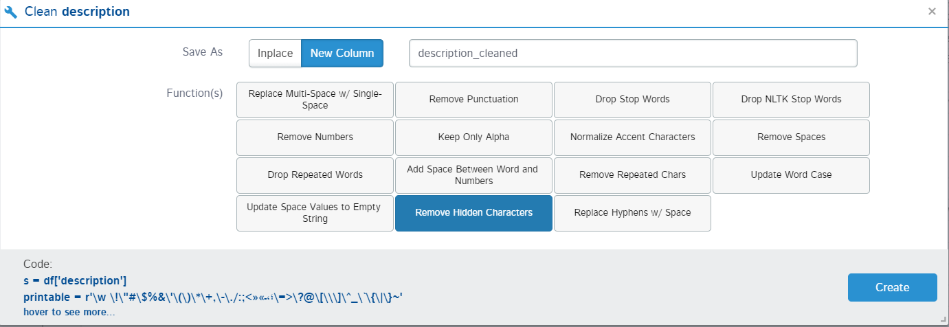
7. Clean columns
This option is only available for string-type values. Text cleaning is a major part of data science projects. It can improve the model performance if the right type of cleaning is done. D-Tale provides all the possible text cleaning methods that can be applied to the text. You simply need to select the methods you want to apply to the text and the work will be done in the backend.
Main Menu Options
The main menu has almost all the same options as provided in the column menu but in the main menu, they are generalized and you can do the operations in one place on multiple columns rather can manually picking them from the display. Here are some of the options which are exclusive to the Main menu and work differently.
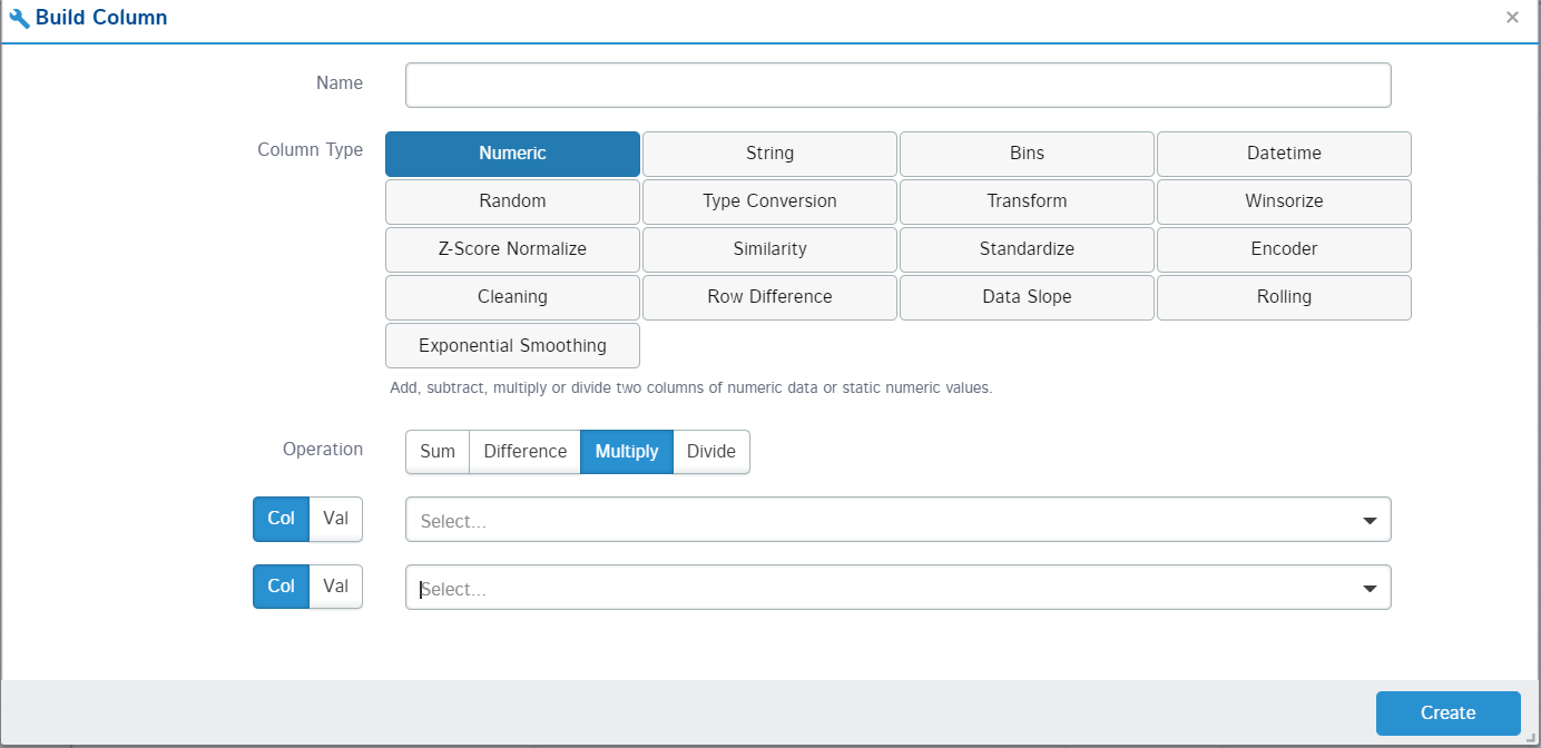
1. Build Column
This option allows you to create new features/columns out of the already available columns. You can create these new features by performing arithmetic operations on columns or using two columns to perform operations. You can also provide the name of the new column to be made and its datatype.
2. Summarize Data
In pandas, we summarise the data via group-by or pivot tables. The same thing you can do with this package too. The pandas required you to write the code for every group by and pivot tables but with D-Tale, you can select the columns, the aggregation function, and the columns you want in the final dataset. Let’s create a group by a summary by the year for the mean duration of the movies:
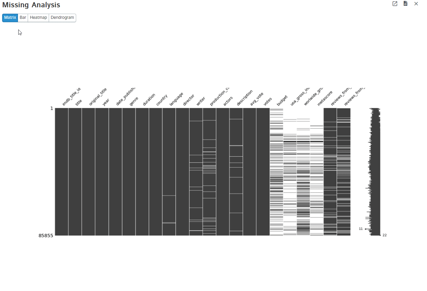
3. Missing Analysis
Missing data is a common problem in any type of dataset. No dataset is perfect and it has a lot of missing values intentionally or not. D-Tale uses missingno python package to visualize the missing values present in the dataset. It provides matrix, bar, heatmap, and dendrogram too.
4. Charts
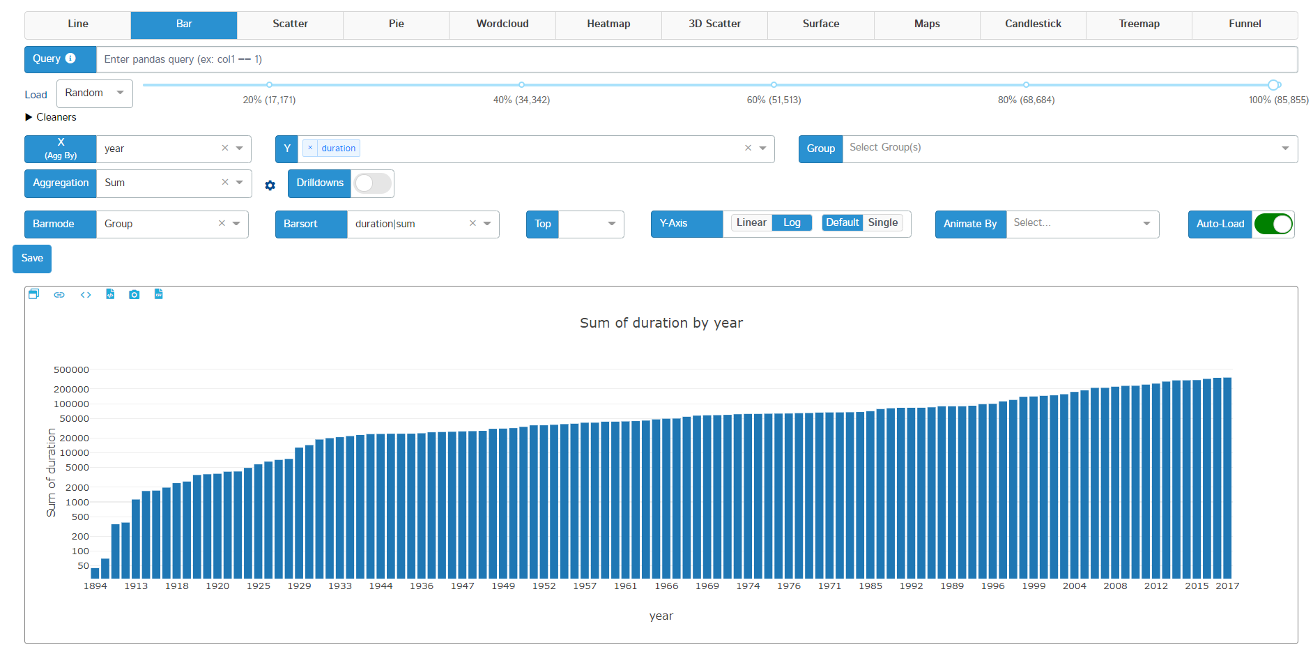
Plotting is an essential step in any data science exploratory analysis stage. You can use any type of plotting library to plot your figures. D-Tale uses plotly to create interactive plots on the go. It offers Line, Bar, Scatter, Pie, word cloud, Heatmap, 3D scatter, Surface, Maps, Candlestick, Treemap, and funnel charts. Different types of data support different types of plots.
Here is an example of a bar plot with some configurations selected and where the x-axis denote the year and the y-axis denotes the aggregated sum of the duration of movies:
5. Highlighters
These are used to highlight some sections of the dataset. Like we use stylers in pandas to bring out the odd values, highlighters do the same job. You can highlight missing values, Data types, Outliers, and range. The example below shows how the missing values and outliers have been highlighted:
6. Code Export and Data Export
All the operations you have done on your dataframe in D-Tale are automatically converted into their python/pandas/plotly equivalent code. They can be accessed by clicking on the export code option present at every operation and chart GUI. See the code generated for some of the operations done on the dataset:
# DISCLAIMER: 'df' refers to the data you passed in when calling 'dtale.show'
import pandas as pd
from dtale.datasets import {dataset}
df = {dataset}()
if isinstance(df, (pd.DatetimeIndex, pd.MultiIndex)):
	df = df.to_frame(index=False)
# remove any pre-existing indices for ease of use in the D-Tale code, but this is not required
df = df.reset_index().drop('index', axis=1, errors='ignore')
df.columns = [str(c) for c in df.columns]  # update columns to strings in case they are numbers
df = df[[c for c in df.columns if c != 'imdb_title_id']]
df = df.rename(columns={'title': 'Movie_title'})
s = df['date_published']
s = df['date_published']
s = s.replace({
	'TV Movie 2019': np.nan})
df.loc[:, 'date_published'] = s
df.loc[:, 'date_published'] = pd.Series(pd.to_datetime(df['date_published'], infer_datetime_format=True), name='date_published', index=df['date_published'].index)
The code export option in the main menu captures all the changes done on the dataframe. You can directly export the final dataset after changes to CSV or TSV using the export option.
Conclusion
In this detailed article, we saw some of the features of D-Tale which is indeed a powerful package. There are still more functions to explore and you should definitely check them out. If I compare it with Mito, which aims to provide spreadsheet-like operations in Python, then D-Tale truly has an edge over it in terms of the functions provided.
Want to know more about Mito? Then check out my this article: Exploring Mito: Automatic Python Code for SpreadSheet Operations
If you have any doubts, queries, or potential opportunities, then you can reach out to me via
1. Linkedin – in/kaustubh-gupta/
2. Twitter – @Kaustubh1828
3. GitHub – kaustubhgupta
4. Medium – @kaustubhgupta1828
The media shown in this article are not owned by Analytics Vidhya and are used at the Author’s discretion.
Kaustubh Gupta is a skilled engineer with a B.Tech in Information Technology from Maharaja Agrasen Institute of Technology. With experience as a CS Analyst and Analyst Intern at Prodigal Technologies, Kaustubh excels in Python, SQL, Libraries, and various engineering tools. He has developed core components of product intent engines, created gold tables in Databricks, and built internal tools and dashboards using Streamlit and Tableau. Recognized as India’s Top 5 Community Contributor 2023 by Analytics Vidhya, Kaustubh is also a prolific writer and mentor, contributing significantly to the tech community through speaking sessions and workshops.


