In my previous article, I discussed the theoretical concepts of outliers and explored when to drop or keep them. Now, I will focus on outlier detection and treatment methods. Identifying and removing outliers is crucial in feature engineering before training machine learning models, as they can degrade predictive performance in classification or regression tasks. This article covers outlier detection in Python and machine learning, including techniques like Z-score, IQR, and clustering using libraries such as Pandas and Scikit-learn. Proper outlier handling during data pre-processing ensures unbiased results, enhancing model accuracy and reliability across domains like finance and healthcare. I recommend reviewing this article for a comprehensive understanding of outlier analysis in data science projects, as it consolidates key concepts and practical approaches for effective outlier management.
This article was published as a part of the Data Science Blogathon.
Table of contents
What is an Outlier?
Outlier is a data point that stands out significantly from the rest of the data. It can be an extremely high or low value compared to the other observations in a dataset. Outliers can be caused by measurement errors, natural variations in the data, or even unexpected discoveries.
Types of Outliers
There are 3 main types of outliers:
- Global outliers: Stand out from the entire dataset, like a lone wolf.
- Contextual outliers: Depend on their surroundings, like a high sale at a clothing store.
- Collective outliers: Groups that deviate together, like a cluster of oddly high values.
What is the Outlier Detection Method?
Outlier detection is a method used to find unusual or abnormal data points in a set of information. Imagine you have a group of friends, and you’re all about the same age, but one person is much older or younger than the rest. That person would be considered an outlier because they stand out from the usual pattern. In data, outliers are points that deviate significantly from the majority, and detecting them helps identify unusual patterns or errors in the information. This method is like finding the odd one out in a group, helping us spot data points that might need special attention or investigation.
Checkout this article about the Machine Learning Algorithms
How to Treat Outliers?
There are several ways to treat outliers in a dataset, depending on the nature of the outliers and the problem being solved. Here are some of the most common ways of treating outlier values.
Trimming
It excludes the outlier values from our analysis. By applying this technique, our data becomes thin when more outliers are present in the dataset. Its main advantage is its fastest nature.
Capping
In this technique called “outlier detection,” we cap our data to set limits. For instance, if we decide on a specific value, any data point above or below that value is considered an outlier. The number of outliers in the dataset then gives us insight into that capping number. It’s like setting a boundary and saying, “Anything beyond this point is unusual,” and by doing so, we identify and count the outliers in our data.
For example, if you’re working on the income feature, you might find that people above a certain income level behave similarly to those with a lower income. In this case, you can cap the income value at a level that keeps that intact and accordingly treat the outliers.
Treating outliers as a missing value: By assuming outliers as the missing observations, treat them accordingly, i.e., same as missing values imputation.
You can refer to the missing value article here.
Discretization
In the method of outlier detection, we create groups and categorize the outliers into a specific group, making them follow the same behavior as the other points in that group. This approach is often referred to as Binning. Binning is a way of organizing data, especially in outlier detection, where we group similar items together, helping us identify and understand patterns more effectively.
You can learn more about Encoding Numerical Features in Machine Learning
How to Detect Outliers?
For Normal Distributions
- Use empirical relations of Normal distribution.
- The data points that fall below mean-3*(sigma) or above mean+3*(sigma) are outliers, where mean and sigma are the average value and standard deviation of a particular column.
For Skewed Distributions
- Use Inter-Quartile Range (IQR) proximity rule.
- The data points that fall below Q1 – 1.5 IQR or above the third quartile Q3 + 1.5 IQR are outliers, where Q1 and Q3 are the 25th and 75th percentile of the dataset, respectively. IQR represents the inter-quartile range and is given by Q3 – Q1.
For Other Distributions
- Use a percentile-based approach.
- For Example, data points that are far from the 99% percentile and less than 1 percentile are considered an outlier.

How to Detect and Remove Outliners in Python?
Z-score Treatment
Assumption: The features are normally or approximately normally distributed.
Step 1: Importing necessary dependencies
import numpy as np
import pandas as pd
import matplotlib.pyplot as plt
import seaborn as sns
Step 2: Read and load the dataset
df = pd.read_csv('placement.csv')
df.sample(5)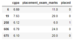
Step 3: Plot the distribution plots for the features
import warnings
warnings.filterwarnings('ignore')
plt.figure(figsize=(16,5))
plt.subplot(1,2,1)
sns.distplot(df['cgpa'])
plt.subplot(1,2,2)
sns.distplot(df['placement_exam_marks'])
plt.show()
Step 4: Finding the boundary values
print("Highest allowed",df['cgpa'].mean() + 3*df['cgpa'].std())
print("Lowest allowed",df['cgpa'].mean() - 3*df['cgpa'].std())
Output:
Highest allowed 8.808933625397177
Lowest allowed 5.113546374602842
Step 5: Finding the outliers
df[(df['cgpa'] > 8.80) | (df['cgpa'] < 5.11)]Step 6: Trimming of outliers
new_df = df[(df['cgpa'] < 8.80) & (df['cgpa'] > 5.11)]
new_df
Step 7: Capping on outliers
upper_limit = df['cgpa'].mean() + 3*df['cgpa'].std()
lower_limit = df['cgpa'].mean() - 3*df['cgpa'].std()
Step 8: Now, apply the capping
df['cgpa'] = np.where(
df['cgpa']>upper_limit,
upper_limit,
np.where(
df['cgpa']<lower_limit,
lower_limit,
df['cgpa']
Step 9: Now, see the statistics using the “Describe” function
df['cgpa'].describe()Output:
count    1000.000000
mean        6.961499
std         0.612688
min         5.113546
25%         6.550000
50%         6.960000
75%         7.370000
max         8.808934
Name: cgpa, dtype: float64
This completes our Z-score-based technique!
IQR Based Filtering
Used when our data distribution is skewed.
Step-1: Import necessary dependencies
import numpy as np
import pandas as pd
import matplotlib.pyplot as plt
import seaborn as sns
Step-2: Read and load the dataset
df = pd.read_csv('placement.csv')
df.head()
Step-3: Plot the distribution plot for the features
plt.figure(figsize=(16,5))
plt.subplot(1,2,1)
sns.distplot(df['cgpa'])
plt.subplot(1,2,2)
sns.distplot(df['placement_exam_marks'])
plt.show()
Step-4: Form a box-plot for the skewed feature
sns.boxplot(df['placement_exam_marks'])
Step-5: Finding the IQR
percentile25 = df['placement_exam_marks'].quantile(0.25)
percentile75 = df['placement_exam_marks'].quantile(0.75)
Step-6: Finding the upper and lower limits
upper_limit = percentile75 + 1.5 * iqr
lower_limit = percentile25 - 1.5 * iqr
Step-7: Finding outliers
df[df['placement_exam_marks'] > upper_limit]
df[df['placement_exam_marks'] < lower_limit]
Step-8: Trimming outliers
new_df = df[df['placement_exam_marks'] < upper_limit]
new_df.shape
Step-9: Compare the plots after trimming
plt.figure(figsize=(16,8))
plt.subplot(2,2,1)
sns.distplot(df['placement_exam_marks'])
plt.subplot(2,2,2)
sns.boxplot(df['placement_exam_marks'])
plt.subplot(2,2,3)
sns.distplot(new_df['placement_exam_marks'])
plt.subplot(2,2,4)
sns.boxplot(new_df['placement_exam_marks'])
plt.show()
Step-10: Capping
new_df_cap = df.copy()
new_df_cap['placement_exam_marks'] = np.where(
    new_df_cap['placement_exam_marks'] > upper_limit,
    upper_limit,
    np.where(
        new_df_cap['placement_exam_marks'] < lower_limit,
        lower_limit,
        new_df_cap['placement_exam_marks']
Step-11: Compare the plots after capping
plt.figure(figsize=(16,8))
plt.subplot(2,2,1)
sns.distplot(df['placement_exam_marks'])
plt.subplot(2,2,2)
sns.boxplot(df['placement_exam_marks'])
plt.subplot(2,2,3)
sns.distplot(new_df_cap['placement_exam_marks'])
plt.subplot(2,2,4)
sns.boxplot(new_df_cap['placement_exam_marks'])
plt.show()
This completes our IQR-based technique!
Percentile Method
- This technique works by setting a particular threshold value, which is decided based on our problem statement.
- While we remove the outliers using capping, then that particular method is known as Winsorization.
- Here, we always maintain symmetry on both sides, meaning if we remove 1% from the right, the left will also drop by 1%.
Steps to follow for the percentile method:
Step-1: Import necessary dependencies
import numpy as np
import pandas as pd
Step-2: Read and Load the dataset
df = pd.read_csv('weight-height.csv')
df.sample(5)
Step-3: Plot the distribution plot of the “height” feature
sns.distplot(df['Height'])Step-4: Plot the box-plot of the “height” feature
sns.boxplot(df['Height'])
Step-5: Finding the upper and lower limits
upper_limit = df['Height'].quantile(0.99)
lower_limit = df['Height'].quantile(0.01)
Step-6: Apply trimming
new_df = df[(df['Height'] <= 74.78) & (df['Height'] >= 58.13)]Step-7: Compare the distribution and box-plot after trimming
sns.distplot(new_df['Height'])
sns.boxplot(new_df['Height'])
Winsorization
Step-8: Apply Capping (Winsorization)
df['Height'] = np.where(df['Height'] >= upper_limit,
        upper_limit,
        np.where(df['Height'] <= lower_limit,
        lower_limit,
        df['Height']))
Step-9: Compare the distribution and box-plot after capping
sns.distplot(df['Height'])
sns.boxplot(df['Height'])
This completes our percentile-based technique!
Conclusion
Outlier detection and removal is a crucial data analysis step for a machine learning model, as outliers can significantly impact the accuracy of a model if they are not handled properly. The techniques discussed in this article, such as Z-score and Interquartile Range (IQR), are some of the most popular methods used in outlier detection. The technique to be used depends on the specific characteristics of the data, such as the distribution and number of variables, as well as the required outcome.
Hope you like the article! Removing outliers in Python is crucial for accurate data analysis. Techniques like the Z-score and IQR methods help in outlier removal. Learn how to remove outliers effectively using Python outlier detection methods for cleaner datasets.
Key Takeaways
- Outliers can be treated in different ways, such as trimming, capping, discretization, or by treating them as missing values.
- Emperical relations are used to detect outliers in normal distributions, and Inter-Quartile Range (IQR) is used to do so in skewed distributions. For all other distributions, we use the percentile-based approach.
- Z-score treatment is implemented in Python by importing the necessary dependencies, reading and loading the dataset, plotting the distribution plots, finding the boundary values, finding the outliers, trimming, and then capping them.
Frequently Asked Questions
Q1. What are some of the most popular outlier detection techniques?
A. Most popular outlier detection methods are Z-Score, IQR (Interquartile Range), Mahalanobis Distance, DBSCAN (Density-Based Spatial Clustering of Applications with Noise, Local Outlier Factor (LOF), and One-Class SVM (Support Vector Machine).
Q2. What are the libraries and plots we can utilize to detect and remove outliers in a data set for a data science project?
A. Libraries like SciPy and NumPy can be used to identify outliers. Also, plots like Box plot, Scatter plot, and Histogram are useful in visualizing the data and its distribution to identify outliers based on the values that fall outside the normal range.
Q3. What is the advantage of removing outliers?
A. The benefit of removing outliers is to enhance the accuracy and stability of statistical models and ML algorithms by reducing their impact on results. Outliers can distort statistical analyses and skew results as they are extreme values that differ from the rest of the data. Removing outliers makes the results more robust and accurate by eliminating their influence. It reduces overfitting in ML algorithms by avoiding fitting to extreme values instead of the underlying data pattern.
Q4. How do you detect an outlier?
To Detect an Outlier here are the points:
Identify data points significantly different from the rest.
Methods:Statistical: Z-score, IQR, box plots
Visual: Scatter plots, histograms
Other: Domain knowledge, machine learning (Isolation Forest, Local Outlier Factor)
Consider: Outlier definition, impact, handling (remove, cap, transform).
I am a B.Tech. student (Computer Science major) currently in the pre-final year of my undergrad. My interest lies in the field of Data Science and Machine Learning. I have been pursuing this interest and am eager to work more in these directions. I feel proud to share that I am one of the best students in my class who has a desire to learn many new things in my field.


Hello, thanks a lot for the article ! Is there a link to download the data: placement.csv file ? Thanks again. Best regards.
thank you so much. this article is well decorated and helpful must say. how can I get the dataset that is used in his article, please?
I wish you guys would provide links to the datasets. That way people like me who trying to learn could do the work as we read the article.