This article was published as a part of the Data Science Blogathon.
Introduction
Detecting the outlier is tedious, especially when we have multiple data types. Hence, we have different ways of detecting outliers for different data types. As for normally distributed data, we can get through the Z-Score method similarly; for skewed data, we can use IQR.
In my last article, I discussed the Z-Score way to handle and eventually removed the outliers from the dataset, but it has its limit; the limit states – “it is only applicable for the data columns that are normally distributed“, but we have to find out the way where we can remove the bad data from left or right skewed distribution as well for that statistics have introduced IQR also known as Inter Quartile Range.
In this article, we will take up the same dataset we took in previously, but this time we will work with skewed data as in real-world projects, we will encounter every kind of data.
Importing Analysis Libraries
Let’s discuss in brief what each library will contribute to our analysis.
- Numpy: For performing the major mathematical calculations, preferably apply the formulae using a pre-defined function.
- Pandas: This is the data manipulation library, which helps deal with tabular data frames, i.e. accessing and changing the same.
- Matplotlib: This is the data visualization library that helps us visualise the business insights’ visual impersonation.
- Seaborn: Seaborn is yet another data visualization library (visually better than matplotlib) built on top of matplotlib.
import numpy as np
import pandas as pd
import matplotlib.pyplot as plt
import seaborn as sns
df = pd.read_csv('placement.csv')
print(df.head())
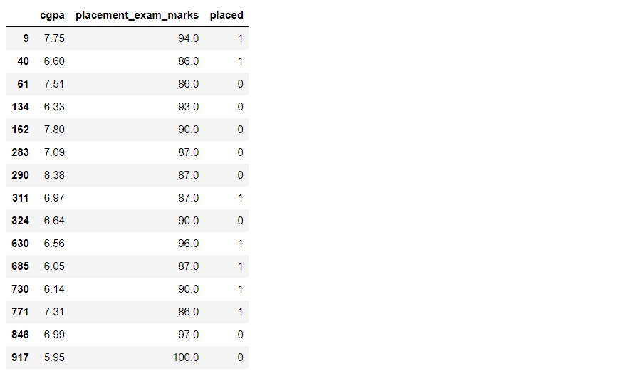
From the read_csv function of pandas, we are reading the placement dataset (the same as we did in our previous article). Here placed is the target column, while CGPA and placement_exam_marks are feature columns.
plt.figure(figsize=(16,5))
plt.subplot(1,2,1)
sns.histplot(df['cgpa'], kde=True)

plt.subplot(1,2,2)
sns.histplot(df['placement_exam_marks'], kde=True)

plt.show()
Output:
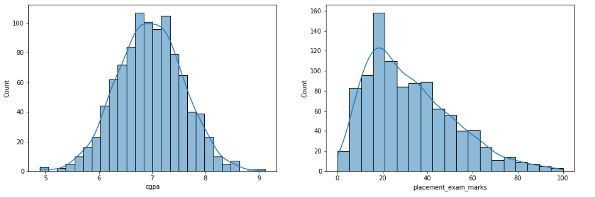
Inference: Our first task is to figure out on which column we can apply the IQR method. As discussed already, we can apply Z-Score on the normally distributed columns while IQR is on either left or right-skewed data.
From the above graph, we can see that the placement marks column is right (positive) skewed, so now, from here in the rest of the article, we will do our outlier detection and analysis on this column only.
df['placement_exam_marks'].describe()
Output:
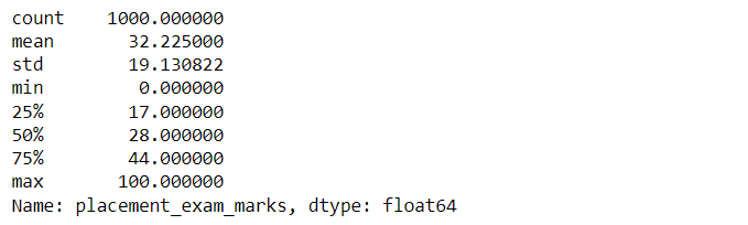
Inference: Here, we are using describe function on top of the selected feature, which stimulates some insights as follows:
- 25th percentile is 17, 50th percentile (median) is 75th percentile is 44.
- The standard deviation is 19.13, the minimum value is 0, and the max is 100.
sns.boxplot(data = df['placement_exam_marks'])
Output:
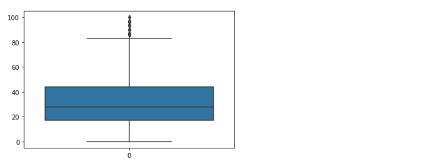
Inference: We used the boxplot to check whether we have outliers in the column that have skewed distribution so that we can remove/deal with them using IQR general method. Conclusively, from the graph/plot, we can see that there are outliers in the upper region but no outliers in the lower region (this we will prove further).
Finding the IQR
So from the above steps, we have got the column on which we will apply the method which is best suited for plots that are not normally distributed or the ones whose plot doesn’t have the bell curve structure. Then after looking at the boxplot for the same column, we figured out that there are outliers that need to be removed, and for that, here is the start of the section where we will start by finding the IQR, i.e. Inter Quartile Range.
percentile25 = df['placement_exam_marks'].quantile(0.25)
percentile75 = df['placement_exam_marks'].quantile(0.75)
Inference: So IQR = (75th quartile/percentile – 25th quartile/percentile). Hence from the above two lines of code, we are first calculating the 75th and 25th quartile using the predefined quantile function.
print("75th quartile: ",percentile75)
print("25th quartile: ",percentile25)
Output:
75th quartile:  44.0
25th quartile:  17.0
Inference: So we got the 75th quartile as 44, i.e. one with 44 marks is just behind 25% of candidates similarly, for the 25th quartile, we have 17 marks i.e. the one with 17 marks is ahead of just 25% of candidates.
iqr = percentile75 - percentile25
print ("IQR: ",iqr)
Output:
IQR: 27.0
Inference: As discussed above, for calculating IQR, we need the 75th percentile and 25th percentile, where IQR is the difference between the 75th and 25th Quartile. Why do we need IQR? The answer is simple – For calculating the upper and lower limit, we need to have the IQR as well, as it is part of the formulae. The value we got is 27.
upper_limit = percentile75 + 1.5 * iqr
lower_limit = percentile25 - 1.5 * iqr

print("Upper limit",upper_limit)
print("Lower limit",lower_limit)
Output:
Upper limit 84.5 Lower limit -23.5
Inference: For calculating the upper limit of the data points, we have formulae as 75th percentile + 1.5 * Inter Quartile Range, and similarly, for lower limit forum ale is as 25th percentile – 1.5 * IQR.
While discussing the boxplot, we saw no outliers in the lower region, which we can see here and the lower limit corresponds to a negative value.
Finding Outliers
So we have by far designed the template for dealing with the outliers and set the threshold value to detect the outliers from the dataset. Now we will use filter conditions on top of the upper and lower limits so that we will get those rows/tuples which are considered to be bad data points.
df[df['placement_exam_marks'] > upper_limit]
Output:
df[df['placement_exam_marks'] > upper_limit].count()
Output:
cgpa                    15
placement_exam_marks    15
placed                  15
dtype: int64
Inference: Firstly, we returned the outliers’ rows; then, with the help of the count function, we learned that the total number of rows was 15.
Trimming
This is the first way we can remove outliers in correct meaning as we don’t give them other certain values or treat them in another way. Trimming removes all the bad data from the dataset just to ensure the quantity of data is not much; otherwise, for analysis, we won’t have much data for ML model development.
new_df = df[df['placement_exam_marks'] < upper_limit]
new_df.shape
Output:
(985, 3)
Comparing
plt.figure(figsize=(16,8))
plt.subplot(2,2,1)
sns.histplot(df['placement_exam_marks'], kde=True)

plt.subplot(2,2,2)
sns.boxplot(data = df['placement_exam_marks'])

plt.subplot(2,2,3)
sns.histplot(new_df['placement_exam_marks'], kde=True)

plt.subplot(2,2,4)
sns.boxplot(data = new_df['placement_exam_marks'])

plt.show()
Output:
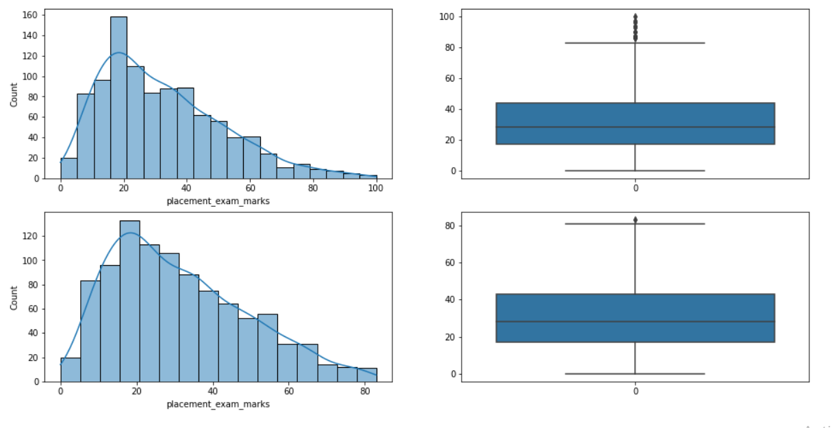
Inference: Time for some visual comparison where we can see in the 3rd and 4th plots that in the distribution plot, we can see a slight spike in the 60-80 segment of the data compared to the plot before trimming.
The main plot, which lets us know whether the outlier is removed or not, is a boxplot. In the graph, when we compare, it’s visible to the naked eye that almost 99% of the outliers are removed.
Capping
Capping is a second way to impute the outliers with some other values. There can be mean, median or mode or any constant value also (that we gonna do here) leads to the condition where there will be no outliers in the dataset.
new_df_cap = df.copy()

new_df_cap['placement_exam_marks'] = np.where(
    new_df_cap['placement_exam_marks'] > upper_limit,
    upper_limit,
    np.where(
        new_df_cap['placement_exam_marks'] < lower_limit,
        lower_limit,
        new_df_cap['placement_exam_marks']
    )
)
Inference: Here first thing we are doing is to have a copy of the original dataset so that we can use it for another analysis as well. Then we are using the np. where() will help us to impute the upper and lower limit values to both regions of outliers, as one can notice in the code.
new_df_cap.shape
Output:
(1000, 3)
Inference: No data is lost as we have not removed the outlier completely. Instead, we imputed the valid values to remain in the range of the upper and lower limit that we set using the IQR technique.
# Comparing

plt.figure(figsize=(16,8))
plt.subplot(2,2,1)
sns.histplot(df['placement_exam_marks'], kde=True)

plt.subplot(2,2,2)
sns.boxplot(data = df['placement_exam_marks'])

plt.subplot(2,2,3)
sns.histplot(new_df_cap['placement_exam_marks'], kde=True)

plt.subplot(2,2,4)
sns.boxplot(data = new_df_cap['placement_exam_marks'])

plt.show()
Output:
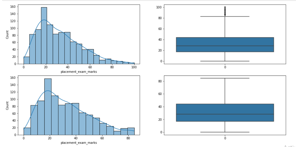
Inference: Time for some comparison, First two plots are the hist and boxplot before we applied the capping technique, so in the boxplot, we can see a lot of outliers/bad data.
On the other hand, after capping, one can see from the naked eye that there are no outliers present in the dataset anymore, and his plot has a slight peak in the 70-80 tile, which stimulates that there are values imputed in that region.
Conclusion
This is the article’s final section, where we will try to cover everything we learned. We discussed how Inter Quartile Range (one of the oblique statistical methods) could deal with bad data or remove the same if needed.
- First, we started by importing all the essential libraries like NumPy, pandas, and matplotlib, which will help the analysis. Then, we plot some graphs to check which feature has skewed data, as IQR method works upon that only.
- The second step is all about finding the IQR using python’s available methods and later finding the outliers using the same method.
- At last, comes the last step, where we used two techniques (Trimming and Capping) to remove the outliers from the dataset.
The media shown in this article is not owned by Analytics Vidhya and is used at the Author’s discretion.


