This article was published as a part of the Data Science Blogathon

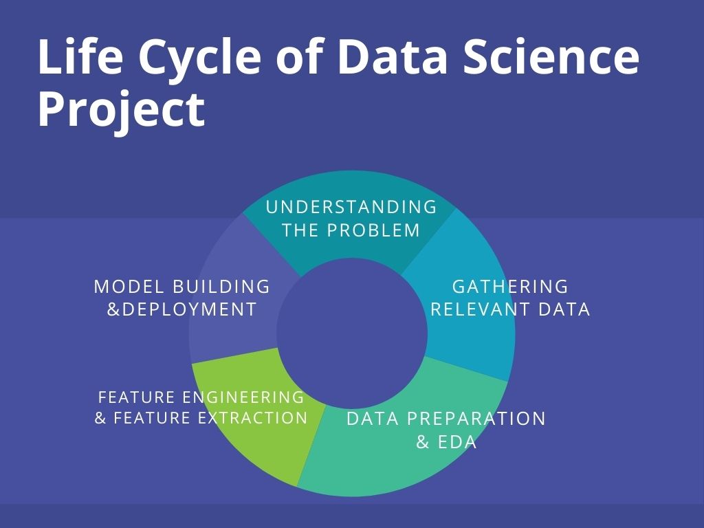
Overview of Lifecycle of Data Science Project
With the increasing demand for Data Scientists, more people are willing to enter into this field. It has become very important to showcase the right skills for Data Science to stand out from the crowd to get placed in the top companies. This is where the projects come into play. Moreover, end-to-end projects give you exposure to a real-time work environment. In this guide, I’ll be explaining the complete life-cycle of a Data Science project with a hands-on demo. We’ll be taking a Machine Learning problem statement and build a web application as its solution using Flask and deploy it on Heroku, a cloud application platform. Let’s get started!
Pic Source: https://bit.ly/3zodc6H
Understanding the Lifecycle of Data Science project using a Problem
The life cycle of a project begins the understanding the problem statement. The problem statement (source) for the project is: To build a web-based application with a machine learning model at the backend that predicts the burnout rate of company employees based on various work-life factors such as – working hours, work-from-home availability, mental fatigue score, and the like.
Case Study: Happy and healthy employees are undoubtedly more efficient at work. They assist the company to thrive. However, the scenario in most of the companies has changed with the pandemic. Since work from home, over 69% of the employees have been showing burnout symptoms (survey source: Monster). The burnout rate is indeed alarming. Many companies are taking steps to ensure their employees stay mentally healthy. As a solution to this, we’ll build a web app that can be used by companies to monitor the burnout of their employees. Also, the employees themselves can use it to keep a check on their burnout rate (no time to assess the mental health in the fast work-life 😔).
Gathering Relevant Data
There are many libraries in python – Beautiful Soap, Selenium for scraping data. Besides, there are also web scraping APIs like ParseHub, Scrappy, Octoparse that make this less time-consuming. Web scrapping is a crucial part of a Data Science project because the lifecycle depends on the quality and relevance of the Data.
In this project, the dataset has been taken from Kaggle(https://www.kaggle.com/blurredmachine/are-your-employees-burning-out). Have a look at the data before reading further.
Dataset
The following are the data attributes and their description –
- Employee ID: The unique ID allocated by the company to each employee.
- Date of Joining: The date when the employee had joined the company.
- Gender: The gender of the employee.
- Company Type: The type of company where the employee is working in (Service/Product).
- WFH Setup Available: If the work from the home facility is available for the employee (Yes/No).
- Designation: The designation of the employee in his/her organization. In range – [0.0, 5.0], 0.0 is the lowest designation and 5.0 is the highest.
- Resource Allocation: The number of resources allocated to the employee to work, to be interpreted as the number of working hours. In range – [1.0, 10.0] (higher means more resources).
- Mental Fatigue Score: How much mentally tired is the employee in the working hours in the range – [0.0, 10.0] where 0.0 means no fatigue and 10.0 means completely fatigue.
- Burn Rate: The target value in the data of each employee telling the rate of burnout during working hours in the range – [0.0, 1.0] where the higher the value is more is the burnout.
Few important notes about the data:
1. Difference between Stress and Burnout is that burnout is a different state of mind. Under stress, you still manage to cope with pressures. But once burnout takes hold, you’re out of gas and you’ve given up all hope of surmounting your deterrents.
2. When you’re suffering from burnout, you feel more than just being mentally fatigued.
Data Preparation and EDA
After collecting the data, data preparation comes into play. It involves cleaning and organizing the data, which is known to take up more than 80% of data scientists’ work. The real-world data is raw and can be full of duplicates, missing values, and wrong information. Hence the data needs to be cleaned.
Once the data has been organized, we extract the information enfolded in the data and summarize its main characteristics through exploratory data analysis. EDA is an important stage for a well-defined data science project. It is performed before the statistical or machine learning modeling phase.
Enough of theory let’s begin the hands-on part!
df.info()
Output –
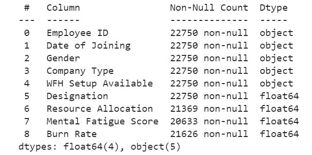
There are 5 categorical features and 4 numerical features. Out of the 5, all the features are useful except the employee id as it has nothing to do with the target i.e – Burn Rate. Let us first perform exploratory data analysis and alongside we’ll transform the categorical features into a form that can be understood by the model.
#Date and month might not be a useful feature. But the year of joining is. It has some significant information that the model can use.
df['Year of Joining'] = df['Date of Joining'].apply(lambda x : x.split('-')[0])
df['Year of Joining'].describe()
Output – The feature has only one unique value i.e 2008. This may not be a useful feature. So we drop it.
df.drop('Year of Joining',axis=1,inplace=True)
Let’s do some EDA on other categorical features. Alongside we’ll also do the Data Preparation part –
Exploratory Data Analysis
sns.boxplot(x = 'Gender', y = 'Burn Rate',data = df);
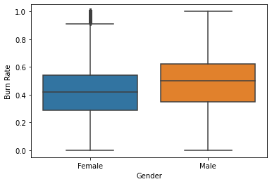
The average (median) Burnout Rate among the male employees is higher than that in female employees. Let’s find the possible reasons by comparing other factors like – designation, working hours, etc. among the two genders in the company.
Note – The boxplot shows that there are outliers in the Burn Rate records of female employees. We’ll have to take care of it.
sns.countplot(x = 'Gender',palette=sns.color_palette("hls"),data = df);
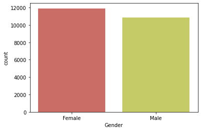
The data has more records of female employees.
sns.countplot(x = 'Designation',hue = 'Gender',palette='Blues_d',data = df);
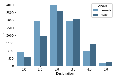
There are more males working at higher designation (>2.0).
sns.boxplot(x = 'Gender', y = 'Resource Allocation',palette=sns.color_palette("Paired"),data = df);
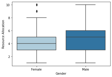
While most of the female employees work up to 8 hours, the male employees work up to 10 hours. Average working (median) hours between both genders differ by 1 hour.
Note – Again we observe outliers in the feature – Resource Allocation in the female records.
sns.boxplot(x = 'Company Type', y = 'Mental Fatigue Score',palette=sns.color_palette("hls"),data = df);
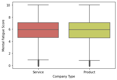
The fatigue scores remain equal for the two types of companies. Note – Outliers
sns.scatterplot(x = 'Mental Fatigue Score', y = 'Burn Rate',hue = 'Designation',palette=sns.color_palette("rocket"),data = df);
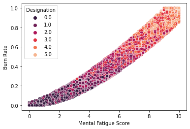
This indicates a very strong linear relationship between the Fatigue Score and Burn rate.
sns.heatmap(df.corr(),annot = True)
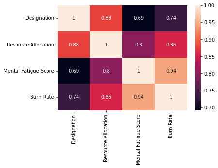
Apart from Mental Fatigue Score, Burn Rate shows a strong positive linear relationship with Resource Allocation.
Categorical Encoding
This is the process of transforming the text data (data under categorical variable) into numbers so that the model is able to understand and extract valuable information from it. These are some powerful techniques of categorical encoding –
- Ordinal Encoding – Involves the mapping of each unique label to an integral value. This type of encoding is advisable only if there is a known order/relationship between the categories. For example – Take an example of a variable Product Quality which has values – ‘Excellent’, ‘Very Good’, ‘Good’, ‘Average’, and ‘Poor’. Since this data has an order i.e ‘Excellent ‘>’Very Good’>’Good’>’Average’>’Poor’, we can use Ordinal Encoding to map – ‘Poor’: 0, ‘Average’: 1, ‘Good’: 2, ‘Very Good’: 3, ‘Excellent’: 4.
- One Hot Encoding – This is the transformation of data into binary values based on the occurrence of categories. This is used only when there is no order/relationship between the categories. For example – In our data, we have a variable called Gender which consists of values – Male and Female. Since there is no order, we use One Hot Encoding.
Let’s continue the hands-on part –
df.drop('Employee ID',axis=1,inplace=True)
We will be using ‘Date of Joining’ in the feature engineering part.
dat = pd.Series(df['Date of Joining'])
df.drop('Date of Joining',axis=1,inplace=True)
Applying One hot encoding –
cat = []

num = []

for feat in df.columns:
    if(df[feat].dtype=='object'):
        cat.append(feat)
    else:
        num.append(feat)
encoder = OneHotEncoder(handle_unknown='ignore', sparse=False)
dummy_df = pd.DataFrame(encoder.fit_transform((df[cat])))
dummy_df.index = df.index
dummy_df.columns = encoder.get_feature_names(cat)
df.drop(cat,axis=1,inplace = True)

df = pd.concat([df,dummy_df],axis=1)
df.drop([‘WFH Setup Available_No’,’Gender_Male’,’Company Type_Product’],axis=1,inplace=True)
Dealing with missing values
Some of the methods that are used to handle null values in the data are –
- Random Sample Imputation – It involves taking random observations from the dataset and using it to replace null values. It is appropriate when the data are missing completely at random (MCAR).
- Imputing Mean/Median – This is the method of filling the missing data with the mean/median of their respective attribute. It is appropriate when the data are missing at random (MAR).
- Predicting the null values – When there is high collinearity between the attribute with null values and the one free of null values, it is suitable to use Linear Regression to predict and fill the missing values.
df.isnull().sum()
- The null values in all the columns are missing at random. Probably the employees didn’t want to share/ hesitated to share the information like stress score, burn rate, and the working hours.
- There are missing values in Burn Rate and Mental Fatigue score. Let’s visualize their distribution.
sns.heatmap(df.isnull())
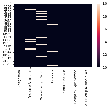
df[df['Burn Rate'].isnull()]['Mental Fatigue Score'].isnull().sum()
We observe that the null values in the two features – do not occur simultaneously (only 172 values occur simultaneously) for a given sample. So we impute the missing value of target through Mental Fatigue Score and vice versa using Linear Regression due to their strong collinearity. We will use median/mean imputation for the rest of the missing values (Where null values occur simultaneously).
x1 = pd.DataFrame(df[df['Burn Rate'].isnull()]['Mental Fatigue Score'])
x1[‘Mental Fatigue Score’].fillna(x1[‘Mental Fatigue Score’].median(),inplace=True) #Filling the simultaneously occuring null values for Mental Fatigue Score with median imputation.
#Imputation using Linear Regression
df_new = df[['Mental Fatigue Score','Burn Rate']] #the training data with no null values
df_new.dropna(inplace=True)
Using Mental Fatigue Score as the independent feature and Burn Rate as the dependent feature in the linear regression model.
X = df_new[['Mental Fatigue Score']] # X.shape should be (N, M) where M >= 1
y = df_new['Burn Rate']
model = LinearRegression()
model.fit(X,y)
pred = model.predict(x1) #the values to be filled in nan values of burn rate
ind = df[df['Burn Rate'].isnull()].index

for j,i in enumerate(ind):
    df['Burn Rate'].iloc[i] = pred[j] #Filling the missing values with the predicted values
Apply the same steps to fill the missing values in Mental Fatigue Score. This time we use Burn Rate as the independent feature and Mental Fatigue Score as the dependent feature for the linear regression model.
X = df_new[['Burn Rate']] # X.shape should be (N, M) where M >= 1
y = df_new['Mental Fatigue Score']
model = LinearRegression()
model.fit(X,y)
x2 = pd.DataFrame(df[df['Mental Fatigue Score'].isnull()]['Burn Rate'])
pred = model.predict(x2)
ind = df[df['Mental Fatigue Score'].isnull()].index
for j,i in enumerate(ind):
  df['Mental Fatigue Score'].iloc[i] = pred[j]
We are left with missing values in Resource Allocation. We will use the same technique i.e Linear Regression to impute the null values of Resource Allocation since it has a high correlation with Designation. The independent feature will be Designation and the target feature will be Resource Allocation.
df_new = df[['Designation','Resource Allocation']]
df_new.dropna(inplace=True)
X = df_new[['Designation']]
y = df_new['Resource Allocation']

model = LinearRegression()
model.fit(X,y)
des = pd.DataFrame(df[df['Resource Allocation'].isnull()]['Designation'])
pred2 = model.predict(des)
ind = df[df['Resource Allocation'].isnull()].index
for j,i in enumerate(ind):
    df['Resource Allocation'].iloc[i] = pred2[j]
Outliers
It’s time to remove the outliers that we detected in few features during EDA using boxplot visualization.
Outliers are points in the data that fall far away from the other observation. The presence of outliers can spoil and mislead the training process of the model. Hence it is important to handle them.
Here we’ll use log transformation on data to get rid of the outliers. We’ll use this method on the features with the modulus of their skewness >0.5 since data with skewness less than 0.5 follows a fairly symmetrical distribution.
for feat in num:
    if((np.abs(df[feat].skew())>0.5)):
        print(feat)
        df[feat] =np.log1p(df[feat])[0]
Output – There are no such features that have skewness greater than 0.5.
We have completed data preparation and EDA!
Feature Engineering
The process of Feature Engineering involves the extraction of features from the raw data based on its insights. Moreover, feature engineering also involves feature selection, feature transformation, and feature construction to prepare input data that best fits the machine learning algorithms. Feature Engineering influences the results of the model directly and hence it’s a crucial part of data science.
Let’s use Date of Joining to create a new feature – Days Spent that would contain the information about how many days has the employee worked in the company till date. Burn Rate for an employee who has worked for years will be perhaps much higher than a newly joined employee.
present = date.today()
date_df = pd.DataFrame(dat)
date_df['Date of Joining'] = date_df['Date of Joining'].apply(lambda x : datetime.strptime(x,"%Y-%m-%d").date())
df['Days Spent'] = present - date_df['Date of Joining'] #Get the total number of days spent in the company
df['Days Spent'] = df['Days Spent'].apply(lambda x : int(str(x).split(" ")[0]))
Let’s check if the new feature has any effect on the target –
sns.scatterplot(x = df['Days Spent'],y = df['Burn Rate']);
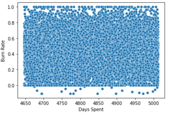
The scatterplot shows that there are no trends in the data of Burn Rate vs Days Spent. So we drop Days Spent as it has no importance in the data.
df.drop('Days Spent',axis=1,inplace=True)
Model Building and Evaluation
Let’s find the performance of different ensemble techniques on the data -> 1.XGBoost 2.AdaBoost 3.RandomForest. Please read this blog for an understanding of ensemble techniques and their different types. We’ll use the ‘R-squared‘ as the metric since we are training a regression model.
model1 = XGBRegressor()
X = df.drop('Burn Rate',axis=1)
y = df['Burn Rate']
score = cross_val_score(model1,X,y,cv = 5,scoring = 'r2') #K fold cross validation
score.mean()
Output – 0.9323
model2 = AdaBoostRegressor()
score = cross_val_score(model2,X,y,cv = 5,scoring = 'r2')
score.mean()
Output – 0.9134
model3 = RandomForestRegressor()

score = cross_val_score(model3,X,y,cv = 5,scoring = 'r2')
score.mean()
Output – 0.9216
All the 3 algorithms have given pretty good results. We can further improve the results by improvising the preceding stages of the lifecycle like scaling the data, changing the technique of null value imputation and categorical encoding, performing feature selection to get rid of unimportant features, hyperparameter optimization, etc.
Hyperparameter optimization
It is the technique of selecting the optimal set of hyperparameters for the ML algorithm that gives the best results on the chosen metric. Random Search, Grid Search, Optuna, etc. are some of the methods to tune the hyperparameters of a learning algorithm.
Let’s optimize the hyperparameters of XGBoost –
regressor = XGBRegressor()
param_grid = {
"colsample_bytree" : np.arange(0.1,1,0.1),

"gamma" : np.arange(0.01,0.1,0.01),

"learning_rate" : np.arange(0.01,0.1,0.01),

"max_depth" : np.arange(2,10),

"n_estimators" : np.arange(1500,2500,100),

"reg_alpha" : np.arange(0,1,0.1),

"reg_lambda" : np.arange(0,1,0.1),

"subsample" : np.arange(0.1,1,0.1),

"silent" : [1],

"nthread" : [-1],

}

model = RandomizedSearchCV(

estimator= regressor,

param_distributions= param_grid,

n_iter=20,

scoring = 'r2',

verbose= 3,

n_jobs=1,

cv = 5

)

model.fit(X,y)
model.best_score_
Output – 0.9327
The hyperparameter tuning has given a slight increase in the model’s score. So we go with this tuned model. Now, let’s save the model-
filename = 'bunrout_model_xgb.pkl'

pickle.dump(model, open(filename, 'wb'))
It’s time for model deployment!
Complete code for the previous stages of the project.
Model Deployment using Heroku

Image Source: https://bit.ly/3EDtb4k
Now our aim is to build a web app that takes input information from the user and gives the prediction of Burn Rate for the user. To build it, we’ll use Flask, an API of Python that allows us to build up applications. After building the app, we’ll deploy it on Heroku.
Note – Other platforms where we can deploy the ML models are – Amazon AWS, Microsoft Azure, Google Cloud, etc.
The input information that we would collect from the user will be the features on which our Burn Rate predictive model has been trained –
- Designation of work of the user in the company in the range – [0 – 5]: 5 is the highest designation and 0 is the lowest.
- The number of working hours
- Mental Fatigue Score in the range – [0-10]: How much fatigue/tired does the user usually feels during working hours.
- Gender: Male/Female
- Type of the company: Service/Product
- Do you work from home: Yes/No
Building app on Flask
Create a .py file for the app.
Import all the important libraries –
from flask import Flask,render_template
import os
from flask import request
import pickle
import pandas as pd
import numpy as np
from xgboost import XGBRegressor
Initiate the Flask app and load the save model –
app = Flask(__name__) #Initialize the flask app
model = pickle.load(open("model\bunrout_model_xgb.pkl", 'rb'))
Do the app routing for the home function that will render HTML page –
@app.route('/')
def home():
    return render_template('index.html')
Create a function 'predict' that will be the most important backend work i.e to give back predictions based on the user input -
@app.route('/predict',methods=['POST'])
def predict():
    if(request.method=="POST"):
        int_feat = ['Designation', 'Resource Allocation', 'Mental Fatigue Score', 'Gender', 'Company Type', 'WFH Setup Available']
        l = []
        for i in int_feat:
            val = int(request.form[i])
            l.append(val)
        #convert into array of shape -> (1,6)
    feat_arr = np.array(l).reshape(-1,1).reshape(1,6)
    input = pd.DataFrame(feat_arr,columns = ['Designation', 'Resource Allocation', 'Mental Fatigue Score', 'Gender_Female', 'Company Type_Service', 'WFH Setup Available_Yes'])
    prediction = float(model.predict(input)[0])
    prediction = round(prediction, 2)
    stat = 0
    #top 25 percentile
    if(prediction<=0.3):
        feedback1 = "Fantastic! You have a low burnout of {} .".format(prediction)
        return render_template("index_1.html",color = "color:#33CC00;",feedback = feedback1)
    #top 25 percentile to 75 percentile
    elif((prediction>0.3) & (prediction<=0.59)):
        feedback2 = "Not bad...You have a moderate burnout of {} .".format(prediction)
        return render_template("index_1.html",color = "color:#339900;",feedback = feedback2)
    #top 75 percentile to 90 percentile
    elif((prediction>0.59) & (prediction<=0.80)):
        feedback3 = "Oops!! You have a high burnout of {} .".format(prediction)
        return render_template("index_1.html",color = "color:#FF0000;",feedback = feedback3)
    #top 90 percentile to 99 percentile
    elif((prediction>0.8) & (prediction<=0.9)):
        feedback4 = "Ouch!!! You have a very high burnout of {} .".format(prediction)
        return render_template("index_1.html",color ="color:#CC0000;",feedback = feedback4)
    #top 99 percentile
    else:
        feedback5 = "Sorry! You have an extremly high burnout of {} .".format(prediction)
        return render_template("index_1.html",color ="color:#990000;",feedback = feedback5)
You can display some messages along with the prediction as in the above code to describe the degree of their burnout rate.
Let’s define the main function –
if __name__ == "__main__":
    app.run('debug'==True)
Your Flask app is ready! Go through index.html for the frontend part of the web app.
Note – Create the index.html and save it in a directory called – templates.
Deploying app on Heroku
Deployment on Heroku requires a reuirement.txt file. The requirements for this project –
| Flask==1.1.1 | |
| pandas==1.0.1 | |
| numpy==1.18.1 | |
| xgboost==0.90 | |
| gunicorn==20.1.0 | |
| scikit-learn>=0.18 |
Now create a Procfile which is a text file without a .txt extension. It defines the commands that are implemented by the app on startup. Procfile for this project –
web: gunicorn app:app
Now push the project into your Github and connect the repo to Heroku for deployment –
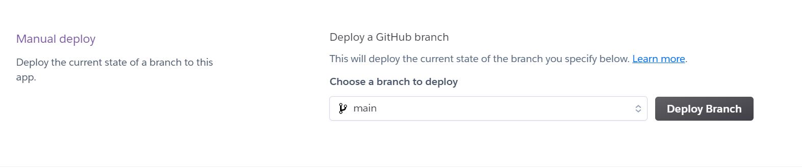
Deploying the Github repo of the project on Heroku
Congratulations! We have successfully created and deployed our web application ✌️

Burnout Rate Prediction web app
Link of the web app: https://burnout-rate-prediction-api.herokuapp.com
It can be accessed from anywhere and be used to keep a check on the mental health of the employees.
Improvisation
After the deployment, improvising the lifecycle stages of the project for delivering the best solution is yet another important stage.
So we have come to the end of the guide. From understanding the problem statement to delivering an end-to-end solution, we have all covered this in a single blog!
Do check the whole project code from – https://github.com/YashK07/Burnout-Rate-Prediction-Heroku. Please do start it 🌟 if you feel the app is worth it. Happy Learning !!
About the author
I am Yash Khandelwal, a 3rd-year undergrad at Birla Institute of Technology, Mesra. Have a look at my other Machine Learning & Deep Learning blogs. Feedbacks are most welcomed 😁
I am looking forward to covering – end-to-end Deep Learning, sports analytics, and computer vision applications in my next blogs.
Connect with me –
Linkedin – https://www.linkedin.com/in/yash-khandelwal-a40484bb/
Github – https://github.com/YashK07
I am currently a final year student pursuing Masters in Mathematics & Computing at Birla Institute of Technology, Ranchi. My areas of experiences and interests include - Data Science, Quantitative research, applied Machine Learning & Deep Learning.