This article was published as a part of the Data Science Blogathon.

Introduction
The data being handled all around the world is just huge. We cannot even imagine how much data is being handled, processed, and used in various industries and companies. To get a better understanding of the data, one must learn how to do a proper analysis of data. There are various steps needed to perform Exploratory Data Analysis. In this article, I am going to explain all about EDA. First, we will see what is EDA? Then will be able to understand Why EDA is important and How to perform EDA? Let’s begin!
What is EDA?
EDA stands for Exploratory Data Analysis. The word “exploratory” means relating to or involving exploration or investigation. Analysis refers to the detailed examination of the elements. So, combinedly, EDA refers to playing with the available data and making it speak about itself 😉 Now, the question is why EDA is important? So, let’s take an example. If few kids want to play a game of chess. Now, to play a game, everyone must know the rules of the game. Then, everyone must understand how to play and how to win the game. If there are more than 2 children, then they won’t be able to play chess together. So, here we need to know the number of players. Then, the players must know about all the pieces. If some pieces are not there, they will not be able to play. Without such basic information and rules, no one can play a game. Similarly, to play with the data, we must have a good understanding of data. What is the data about? What are its attributes? Are there any missing values? Answers to all such questions can be given after EDA. So, let’s start performing EDA. Here, I have taken an interesting data: Movies Data. It has various attributes like movie name, stars, rating, votes, year of release, etc. Let’s try to understand and visualize this data!
Performing EDA on Movies Data
Here, I have chosen a dataset from Kaggle. You can take the dataset from any legal website. The link for the dataset is here.
The dataset contains 9 columns describing the data pattern.
- MOVIES: The movie names are given under the column
- YEAR: The year of the movie or tv show telecast for the audience
- GENRE: The dataset contains many genres most valuable for recommendation system
- RATING: The audience thought about the movie or tv show given
- ONE-LINE: The short description of a movie or tv show for the audiences’ first impression
- STARS: The casting of art is defined under this column which makes talk between the audience
- VOTES: The audience expresses their view under the columns, its useful to identify the impact made by art
- RUN TIME: The duration of the running time of the art
- GROSS: It gives the total amount earned worldwide
Basic Steps:
1. Importing required libraries: To perform EDA and to create data visualizations, we need some libraries like pandas, plotly, matplotlib, seaborn, etc. Refer to Kaggle Notebook for the same.
2. Importing Data in data frame from CSV file. Following is the command to import the data.
df = pd.read_csv('../input/movies-dataset-for-feature-extracion-prediction/movies.csv')
3. Understanding the basics. You can use the following commands here to understand the data.
1. df.shape() : #no of attributes & rows
2. df.info() #datatypes and non null contents
3. df.describe() #statistics like mean, min, max, avg
4. df.isnull().sum() #no of null values in each column

4. Deciding which columns are useful and which are of no use. To remove unnecessary columns/attributes we can use the drop command.
Data Cleaning:
Cleaning the data is a very important step in EDA. It includes removing unnecessary attributes, dealing with null values/duplicates, removing unnecessary characters/strings from attributes values, replacing characters, label encoding, etc. You can refer to the following pieces of code for understanding data cleaning. I have cleaned the data for each attribute respectively.
1. df.drop_duplicates(subset =”MOVIES”,keep = False, inplace = True)
2.for col in [‘GENRE’,’ONE-LINE’,’STARS’]:
df[col] = df[col].str.replace("n","").str.strip()
3.df['Year'] = df['YEAR'].str.extract(r'([0-9]{4}–.*|[0-9]{4})')
df['Year'] = df['Year'].str.strip().replace(")","")
def extract_year(year):
    if year[-3:] == '– )':
        return year.replace('– )',"–")
    else:
        return year.replace(')',"")
df['Year'] = df['Year'].fillna('Unknown')
df['Year'] = df['Year'].apply(lambda y: extract_year(y))
4.df['GENRE'] = df['GENRE'].fillna('Unknown')
5.df['RATING'].fillna(int(df['RATING'].mean()), inplace=True)
6.df['VOTES'] = df['VOTES'].str.replace(',', '')
df['VOTES'] = df['VOTES'].astype(float)
df['VOTES'].fillna((df['VOTES'].mean()), inplace=True)\
7. df['RunTime'].fillna(int(df['RunTime'].mean()), inplace=True)
8.df['Gross'] = df['Gross'].str.replace(',', '').str.replace('$', '').str.replace('M', '')
df['Gross'] = df['Gross'].astype(float)
df['Gross'].fillna((df['Gross'].mean()), inplace=True)
After this, I have separated the STARS column into Stars and Directors using following functions:
def extract_director(direc):
    if 'Director' in direc or 'Directors' in direc:
        director = direc.strip().split("|")[0] # The Second Half is the stars
        return director.split(":")[1] # Return the Director name
    else:
        return ''
def extract_stars(stars):
    if 'Star' not in stars or 'Stars' not in stars:
        return ''
    else:
        return stars.split(":")[-1] # last value in this list will be the stars

df['Director'] = df['STARS'].apply(lambda d: extract_director(d))
df['Stars'] = df['STARS'].apply(lambda s: extract_stars(s))
Understanding the Use of Graphs
Data Visualization Techniques:
There are many data visualization techniques like bar graphs, pie charts, donut graphs, line charts, histograms, box plots, trees, word clouds, joint bar graphs, etc. Here, I have used bar graphs and line charts. We have to understand which graphs and charts are useful for which kind of data. For example, pie diagrams or donut graphs are useful where there are a few categories like species of flowers, age groups, gender, the genre of movies, etc. But, it is useful when a few categories are there(not more than 10). Line charts are useful when we need to compare some numeric values like the rating of movies, year-wise profit/loss trends, etc. Histograms and joint bar graphs organize a group of data points into user-specified ranges. A bar graph presents categorical data with rectangular bars with heights/lengths proportional to their values. Box plots are used to display the distribution of data in the form of min, max, mean, etc.
Performing Data Visualization:
1. First, I checked the unique values present in each column. It helps to decide which graphs should be used.
n = df.nunique(axis=0) print(n)
MOVIES 6398 YEAR 432 GENRE 507 RATING 77 ONE-LINE 6074 STARS 5992 VOTES 3709 RunTime 256 Gross 326 Year 263 Director 2910 Stars 5356 dtype: int64
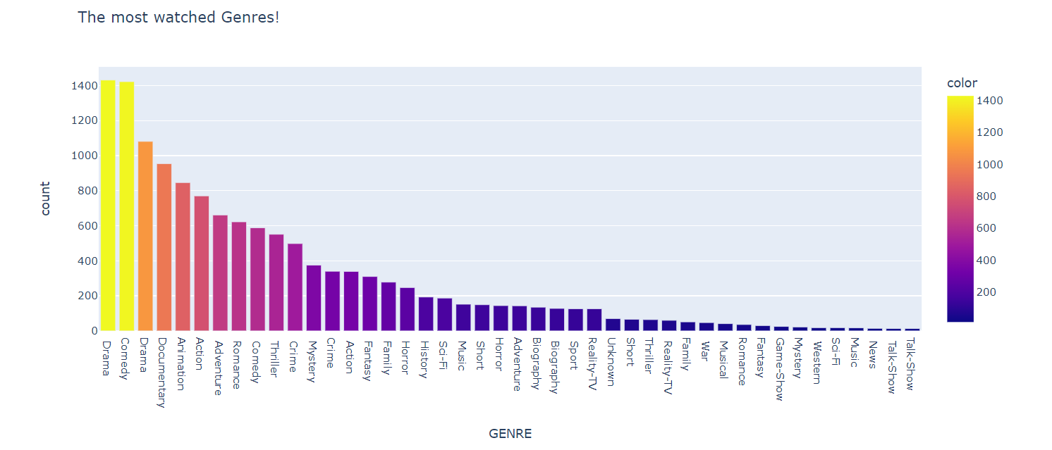
2. First, I checked the most favourite genre. Here is the code:
GENRE = pd.Series(df.GENRE.str.split(',').sum()).value_counts()
GENRE = GENRE[GENRE>10]

px.bar(GENRE, y=GENRE.values, x=GENRE.index, color=GENRE.values, title= 'The most watched Genres!',
    labels={
    'index': 'GENRE',
    'y': 'count'
        })
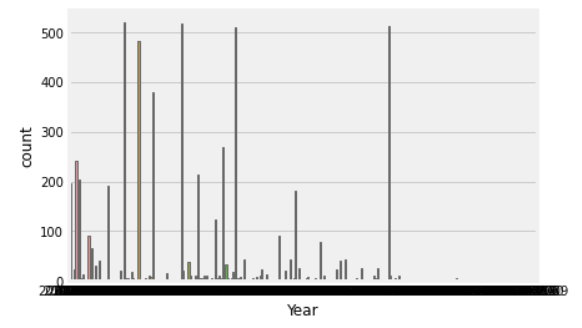
3. Year wise Distribution:
sns.countplot(‘Year’, data=df) plt.show()
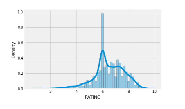
4. sns.distplot(df[“RATING”])
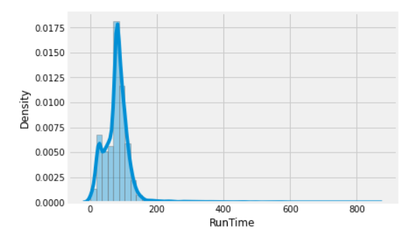
sns.distplot(df[“RunTime”])
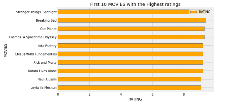
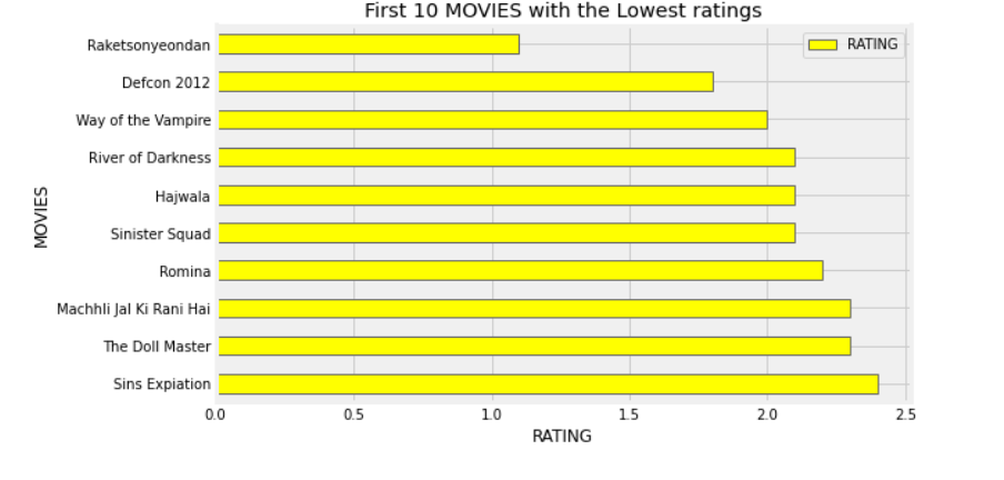
5. Then, I printed the top 10 highest rated movies, top 10 lowest rated movies, top 10 movies with the highest runtime, and top 10 movies with the lowest runtime. Giving the sample code:
highest_rating = df[['MOVIES','RATING']].groupby('MOVIES').sum().sort_values('RATING', ascending=False)
highest_rating.iloc[:10].plot(kind='barh',color=['orange', 'red'])
plt.gcf().set_size_inches(8,5)
plt.title('First 10 MOVIES with the Highest ratings')
plt.gca().invert_yaxis()
plt.xlabel('RATING')
_ = plt.ylabel('MOVIES')
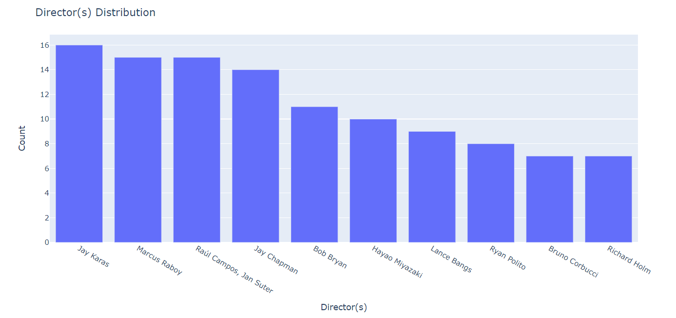
6. Then, I tried to show the most popular directors and stars using following piece of code:
fig = px.bar(data_frame = df[~(df['Director'] == "")]['Director'].value_counts().reset_index().head(10),
             x = 'index', y = 'Director')

fig.update_layout(title = 'Director(s) Distribution',
                  xaxis_title = 'Director(s)',
                  yaxis_title = 'Count')

fig.show()
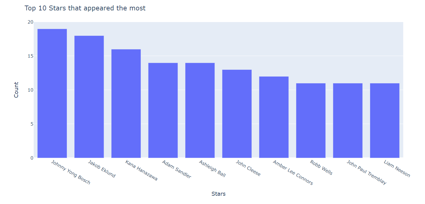
Stars:
from collections import Counter
stars_list = list()

for stars in df[df['Stars'] != ""]['Stars'].to_list():
    stars = stars.split(", ")
    for s in stars:
        stars_list.append(s)

stars_df = pd.DataFrame.from_dict(Counter(stars_list), orient = 'index').rename(columns = {0:'Count'})
stars_df = stars_df.sort_values(by='Count',ascending = False)

fig = px.bar(data_frame = stars_df.head(10),
             x = stars_df.head(10).index, y = 'Count')

fig.update_layout(title = 'Top 10 Stars that appeared the most',
                  xaxis_title = 'Stars',
                  yaxis_title = 'Count')


fig.show()
Like this, you can add more graphs, and charts as per the need.
What did We Understand?
1. What is EDA and why it is important?
2. How to start understanding the data?
3. How to perform Data Cleaning.
4. Which diagrams does one have to use to perform data visualization and EDA.
What’s Next?
Now, using this data, we can perform some tasks like:
1. Predicting the Genre of the movies
2. Predicting rating
3. Recommending Movies based on the data
Conclusion
1. EDA plays a crucial role in understanding the data.
2. There are various commands to understand data; like
df.info(), df.describe(), df.shape()etc.
3. For Data visualization, we have to use various graphs and charts depending on the type of data we want to display.
4. While performing EDA, we have to follow basic steps like importing required libraries, importing data, understanding data, cleaning data, and data visualization.
The media shown in this article is not owned by Analytics Vidhya and is used at the Author’s discretion.


